Client: Kava Collaborative Health
Year: 2026
Scope: Logo Design, Branding, Photography
Deliverables: Logo, Branding Assets, Portraits
Tara and Sara of Kava Collaborative Health came to me in need of a rebrand to revitalize their brand. They were looking for a logo that was rooted in their origins, but better reflected who they are today. By expanding their branding with a new color scheme and multiple assets, they can now communicate effectively to future clients and collaborators.
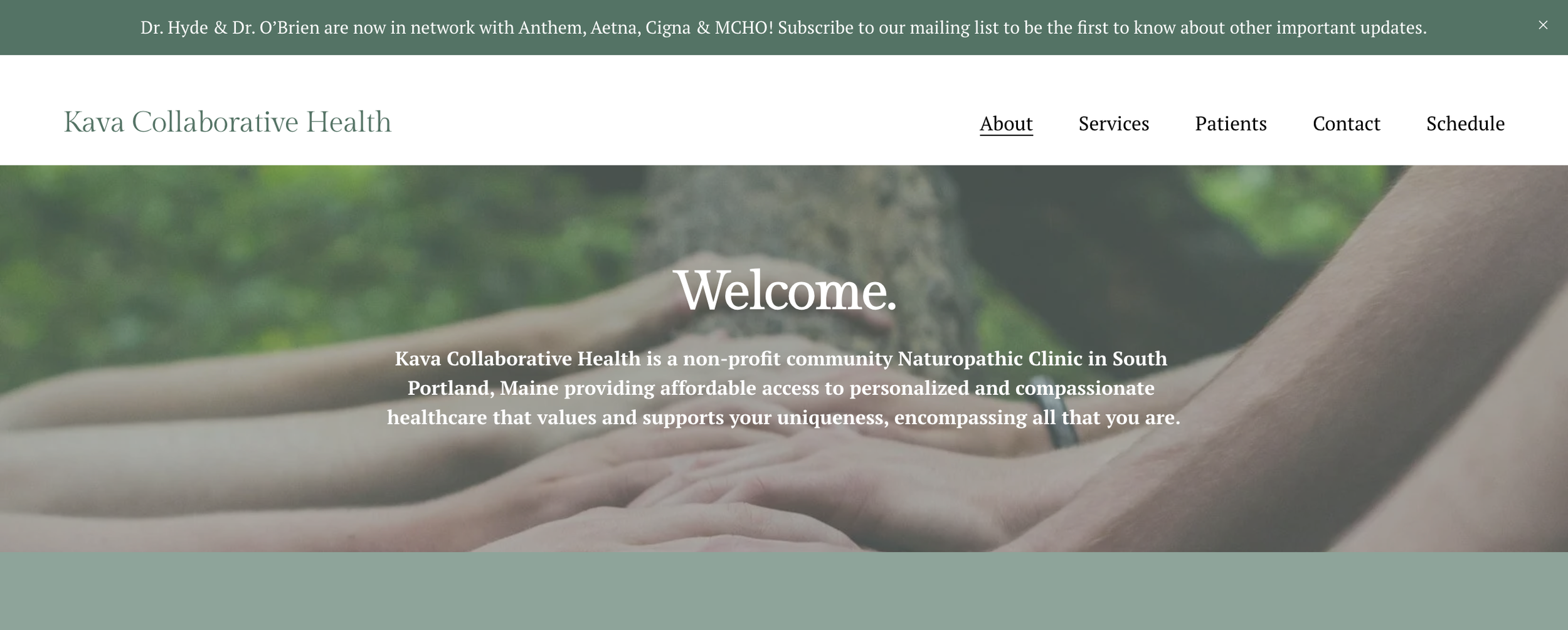
Previous Branding

Inside the sketchbook
First and Second Iterations
FEEDBACK:
Colors- could you find a yellow between the green/yellow of the leaf on 4 and the dots on 2? Or just a total curve ball and get rid of the yellow and go for a new light blue/grey?
#2: could we cut back on the vines and make the leaves a little smaller?
#3: we really like the circle of this one and were wondering if we could do just the leaf in the center with the circle lines coming together with a small opening?
#4: Literally perfect- just wanted to change the coloring a bit. Open to getting rid of the yellow all together and finding a light blue/grey.
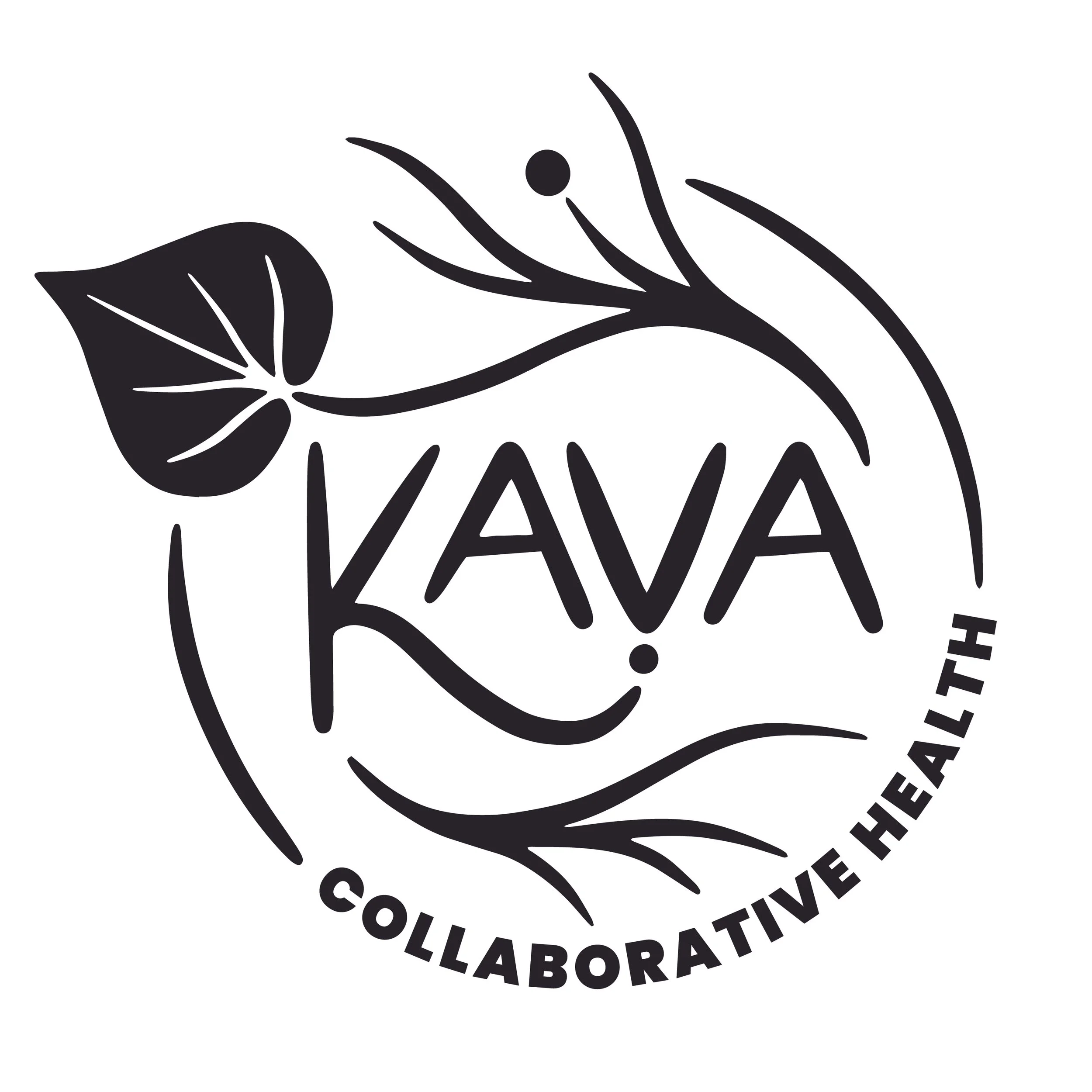
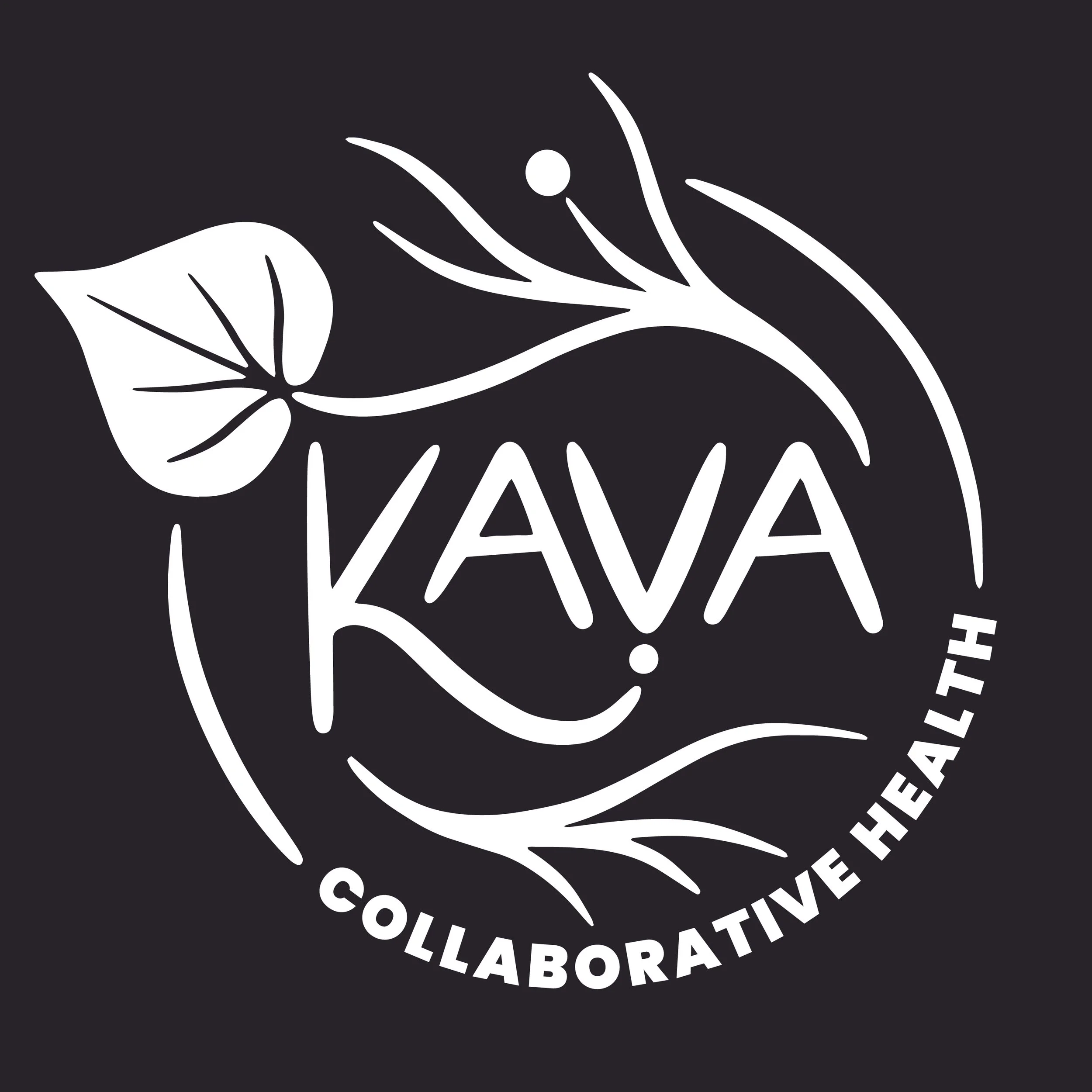
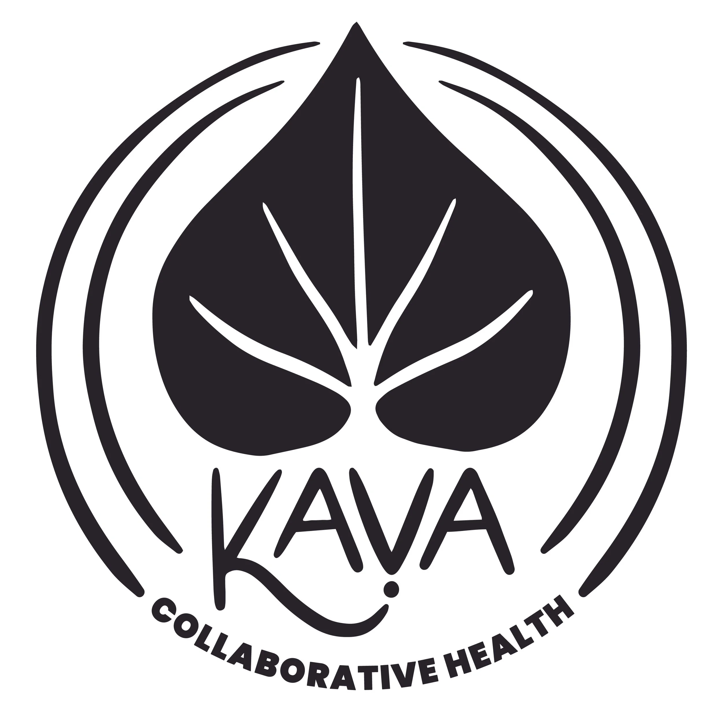
Final Logos & Branding
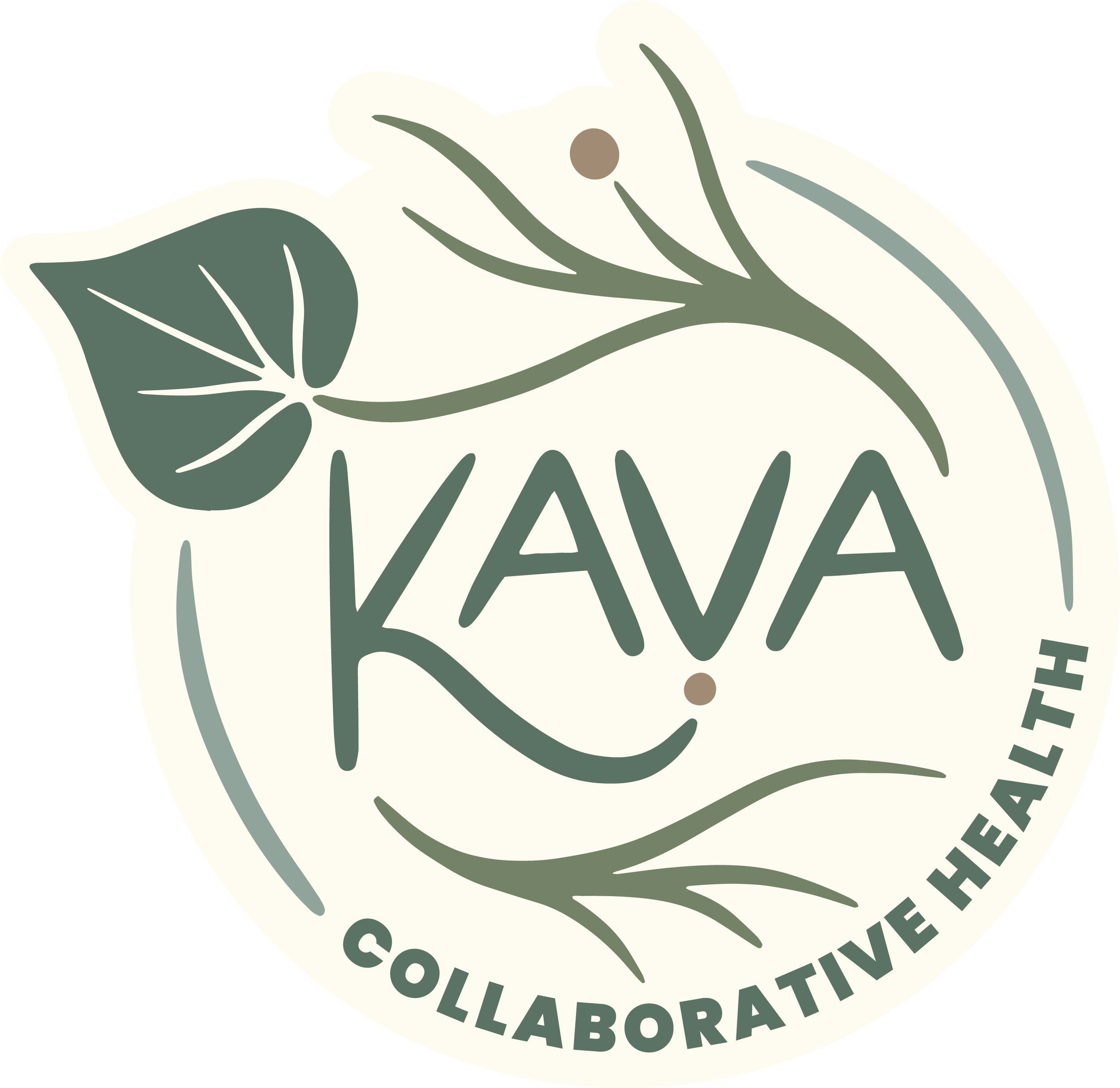
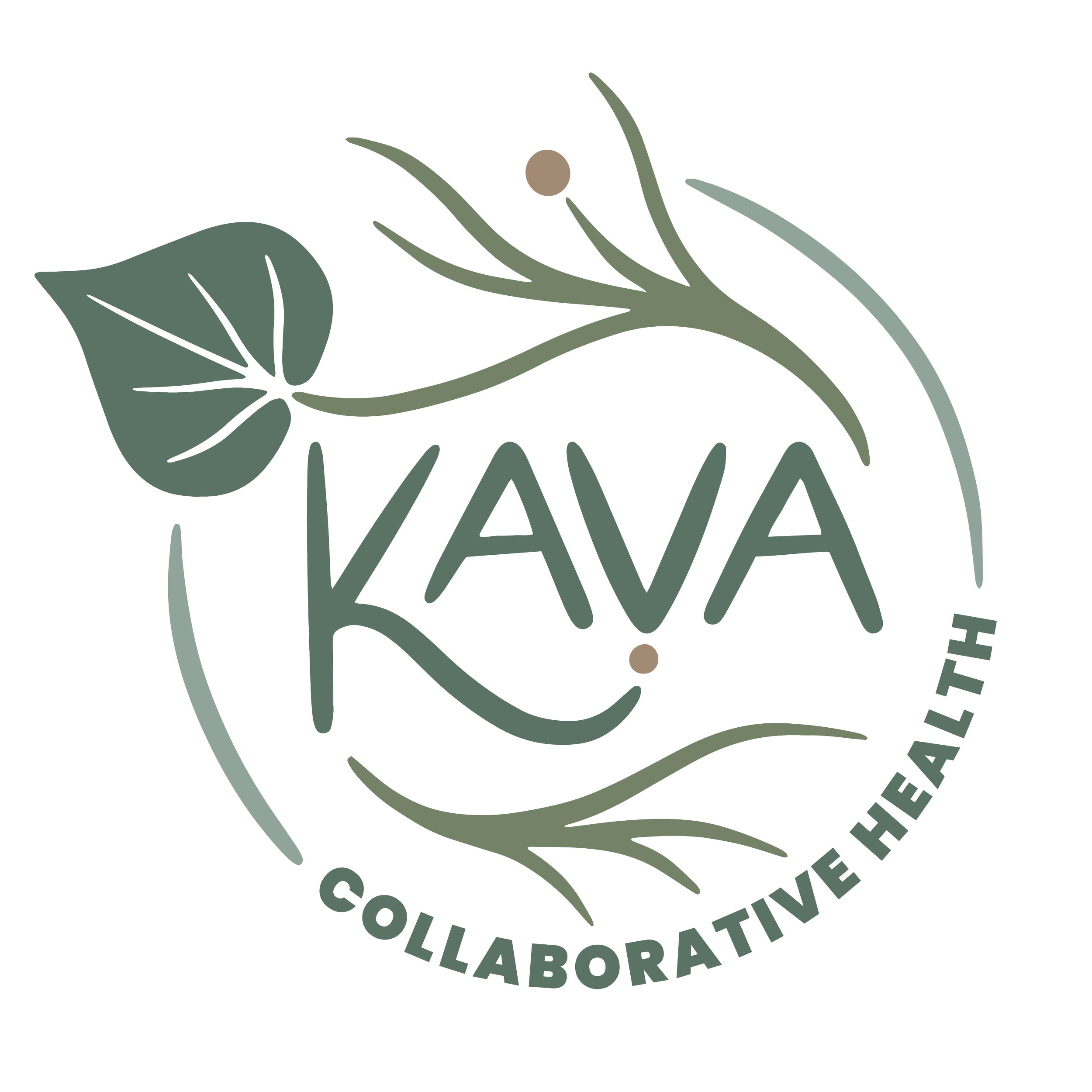
Finalizing all three explorations allows for versatility in various applications for website, socials, brochures, letterheads, packaging and more. The cohesion of the three assets completes Kava’s branding package.
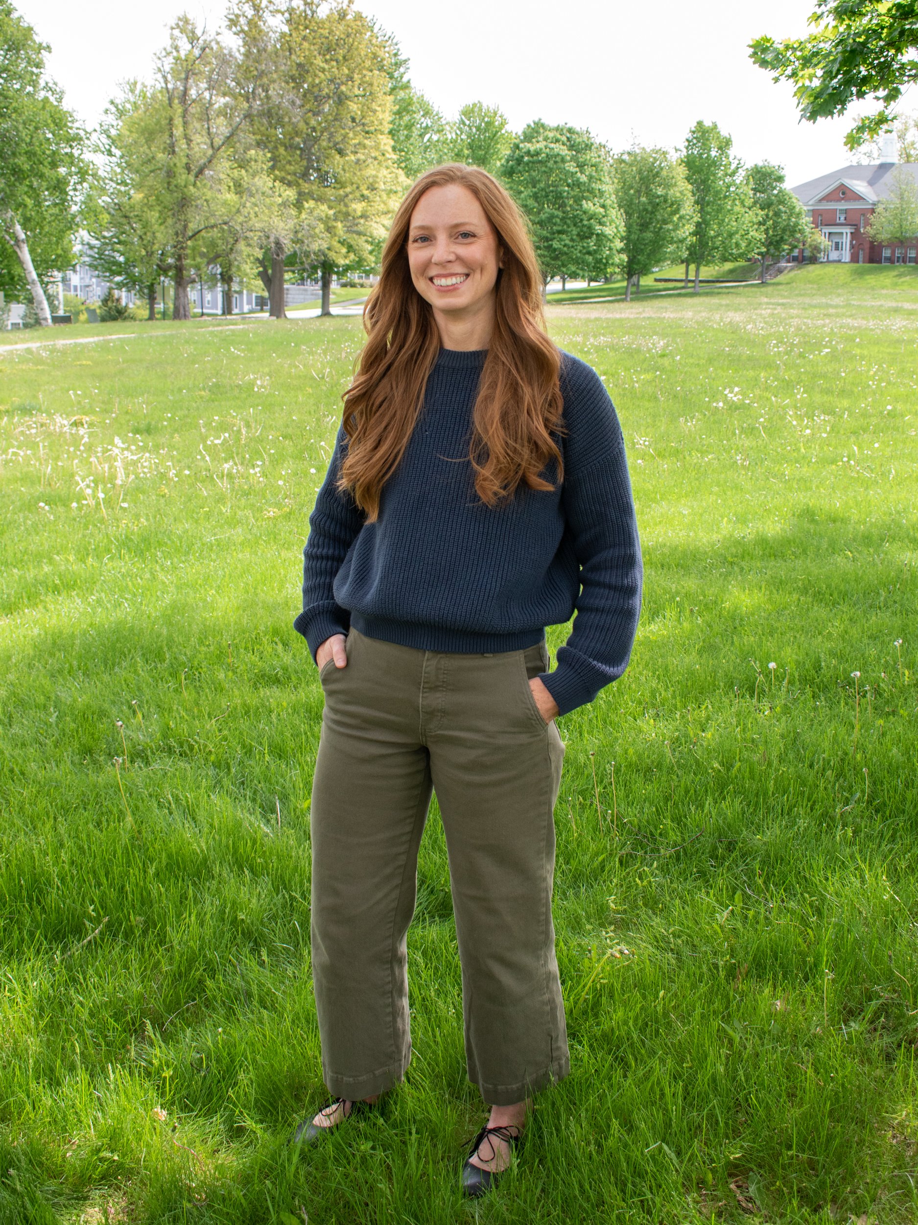
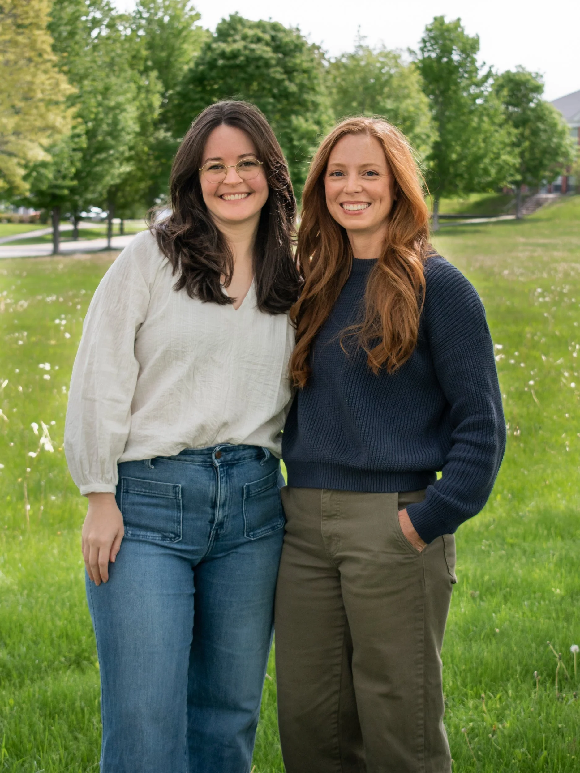
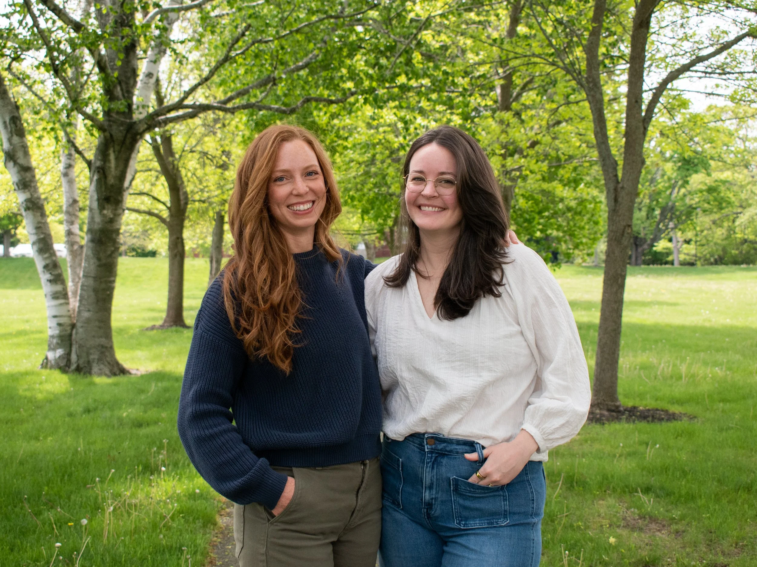
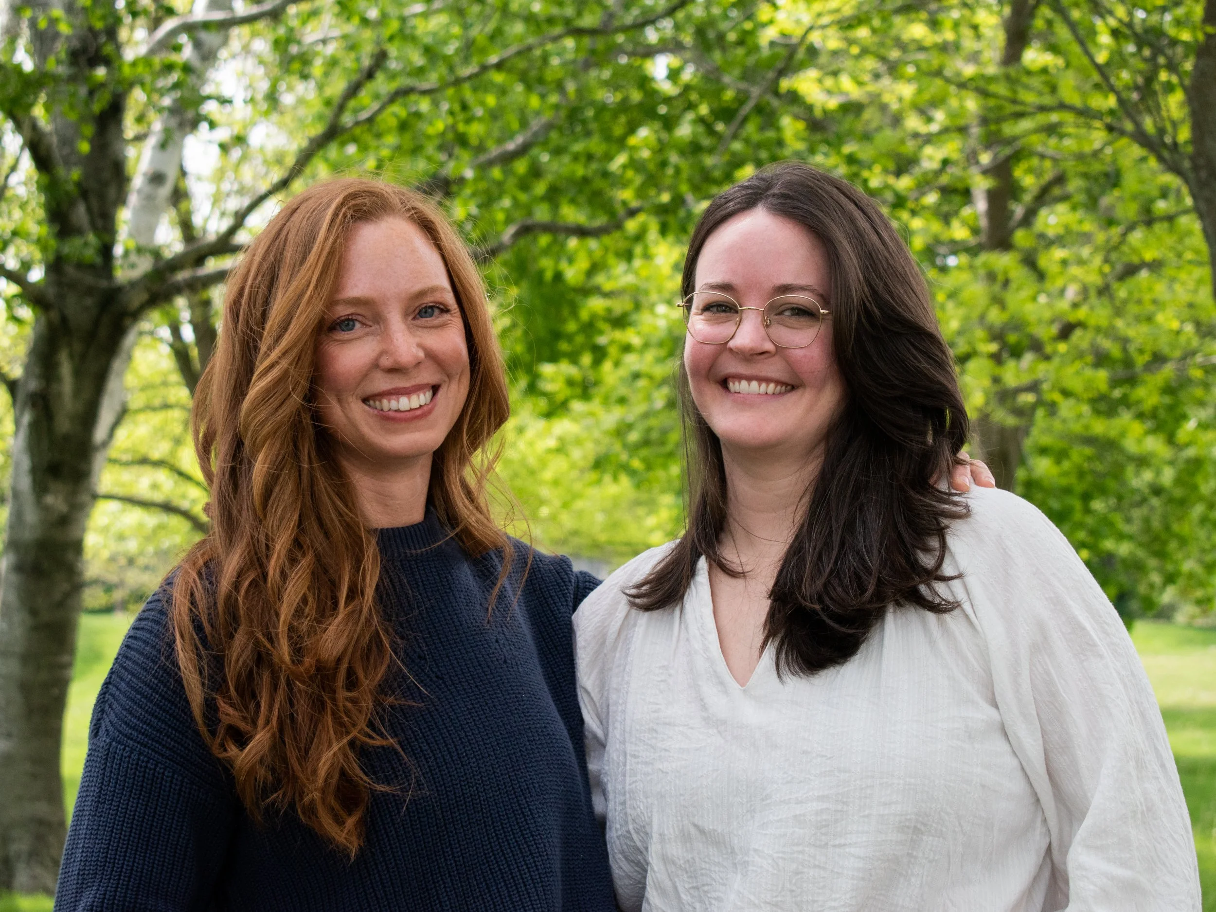
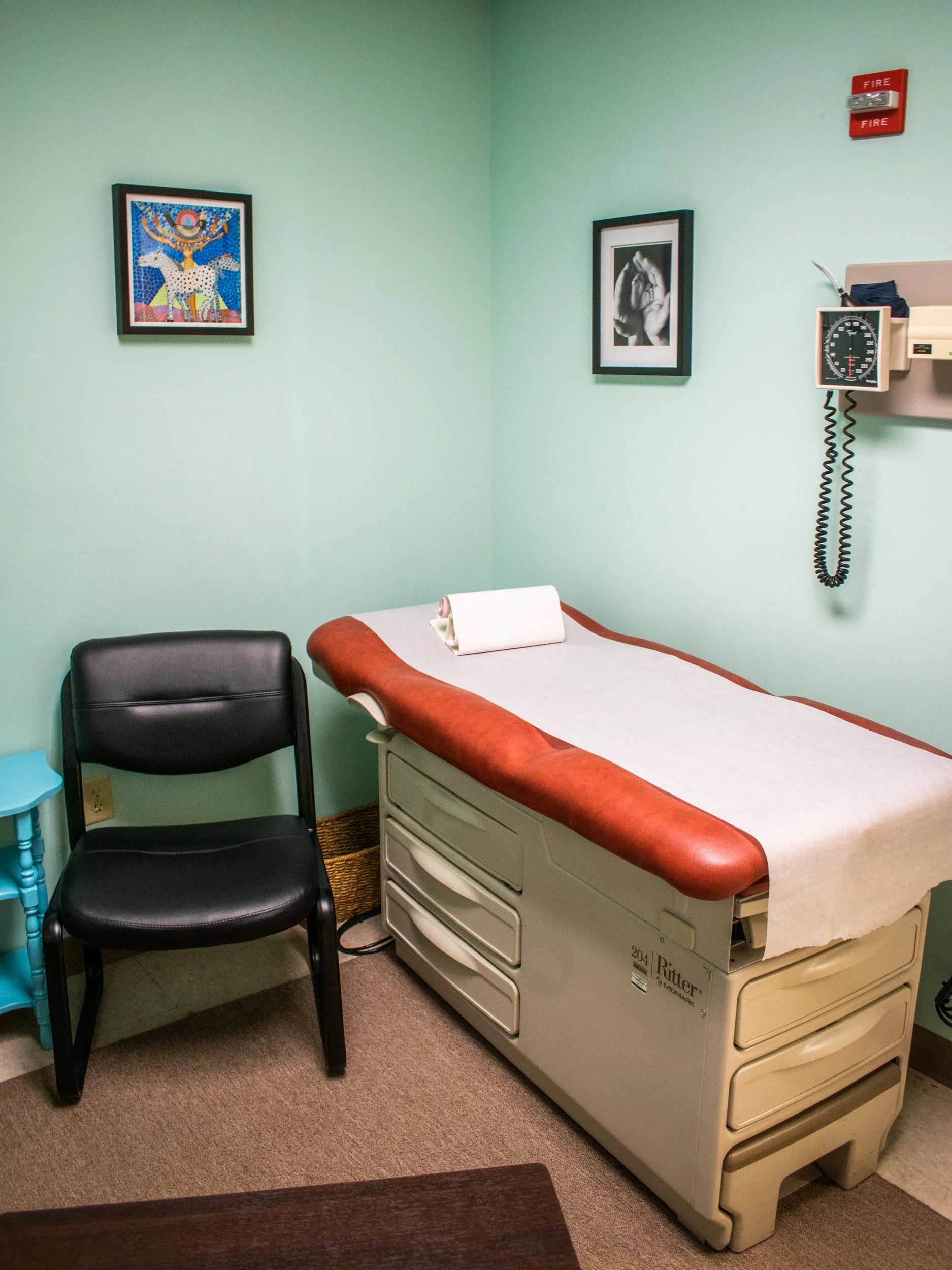
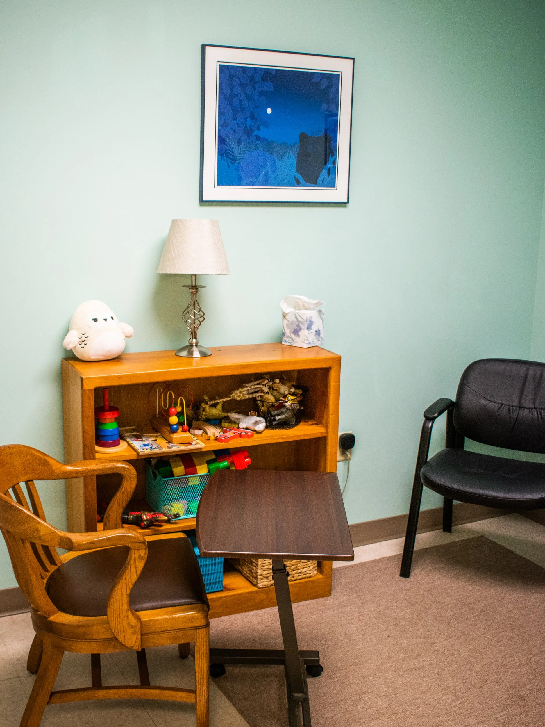
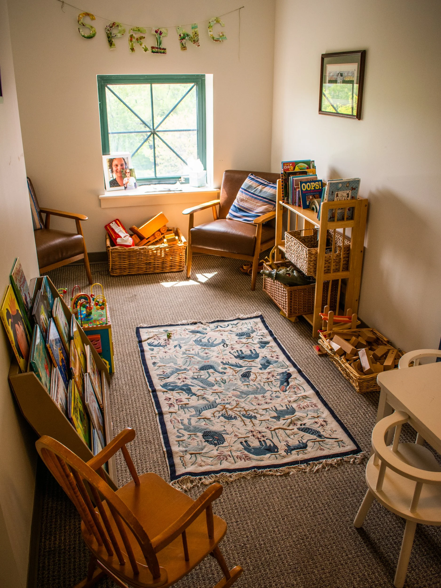
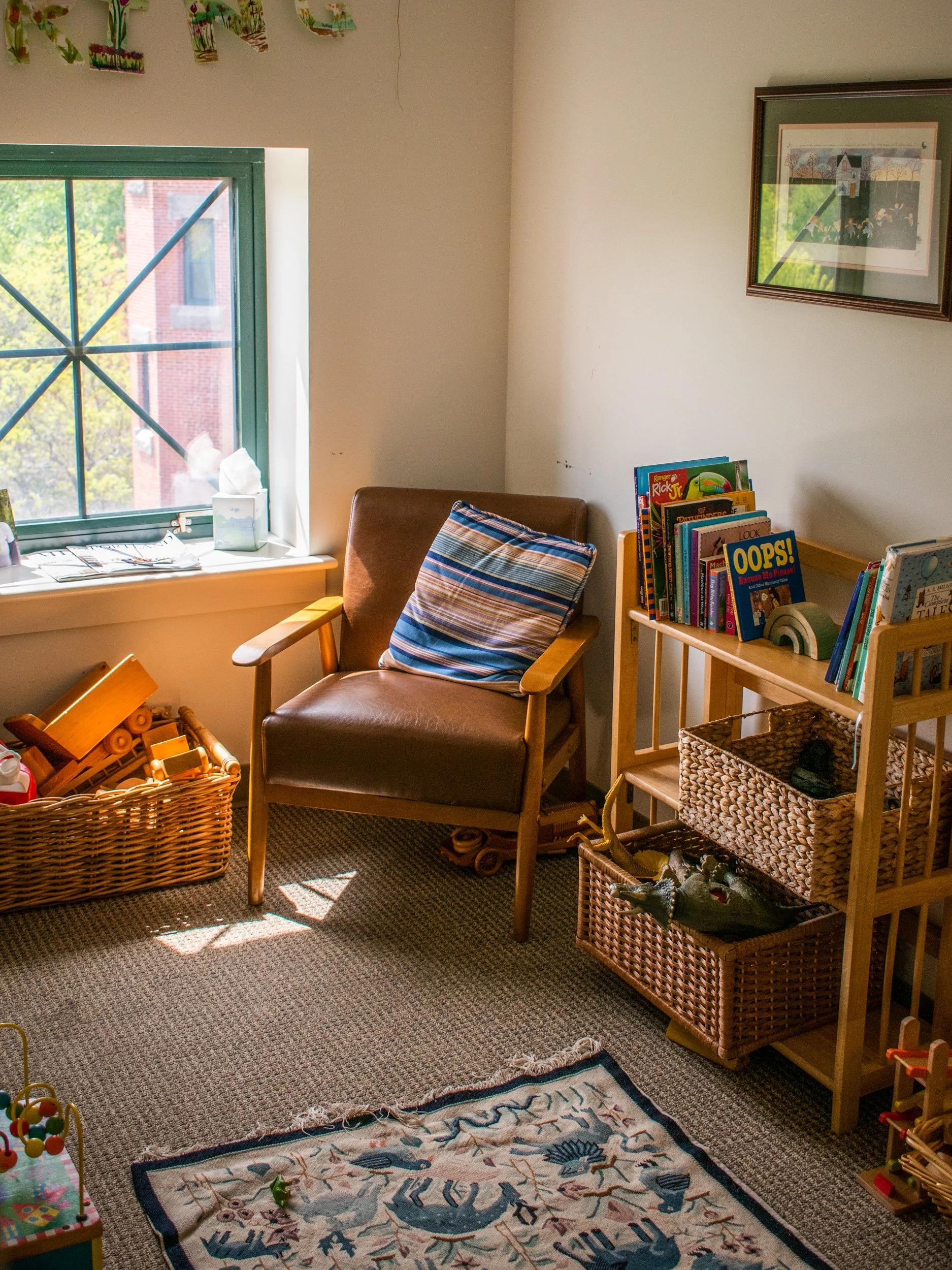
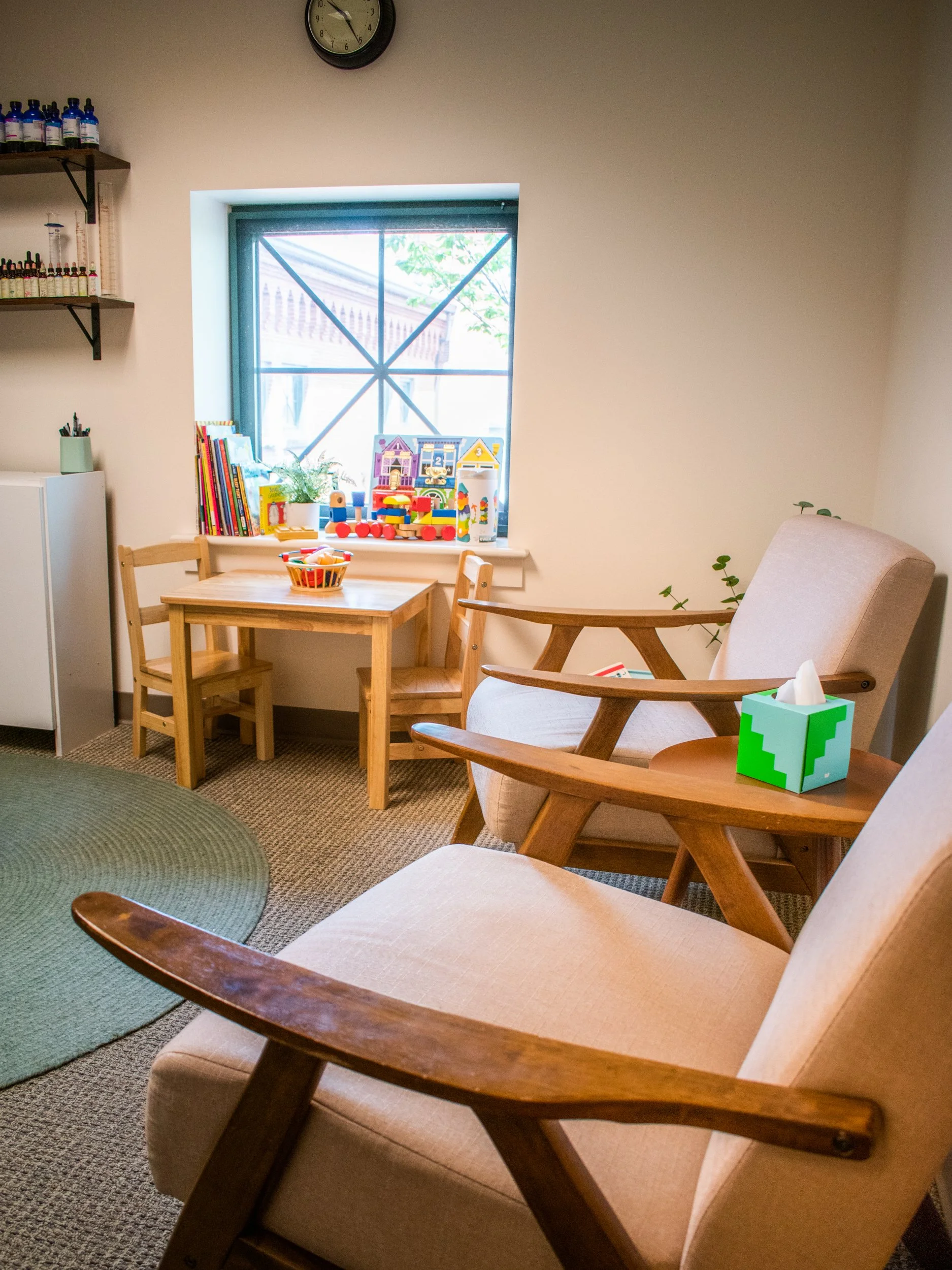
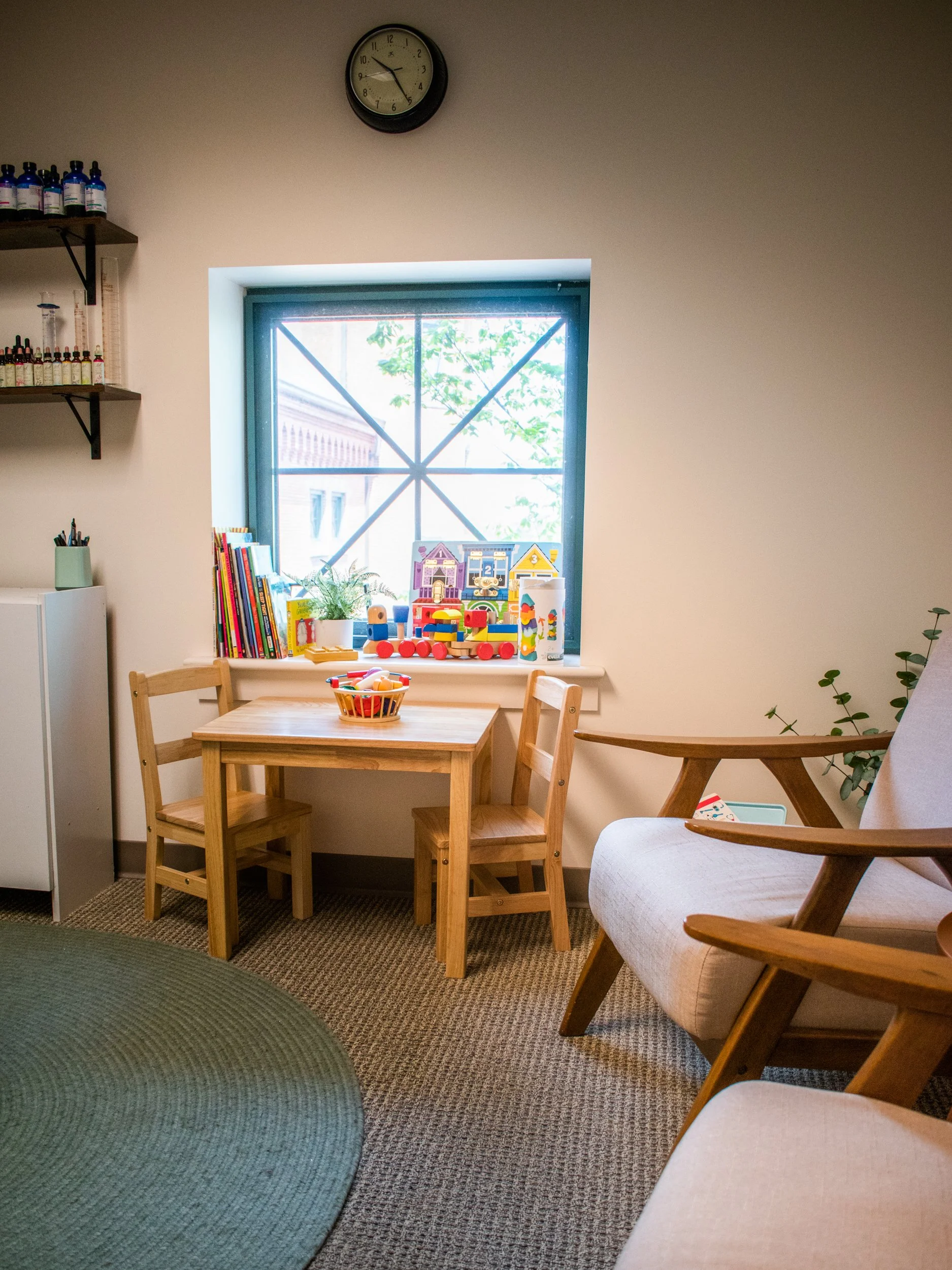
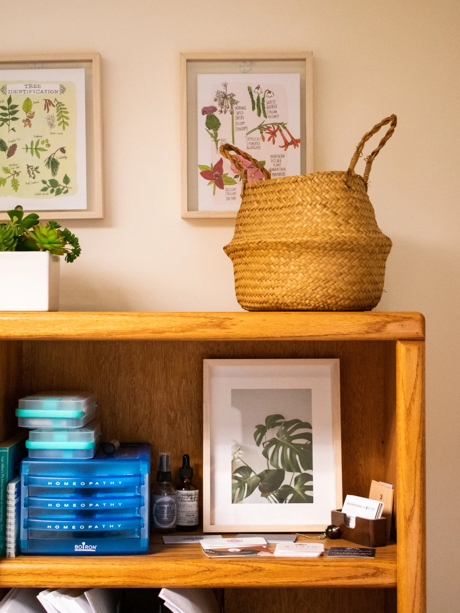
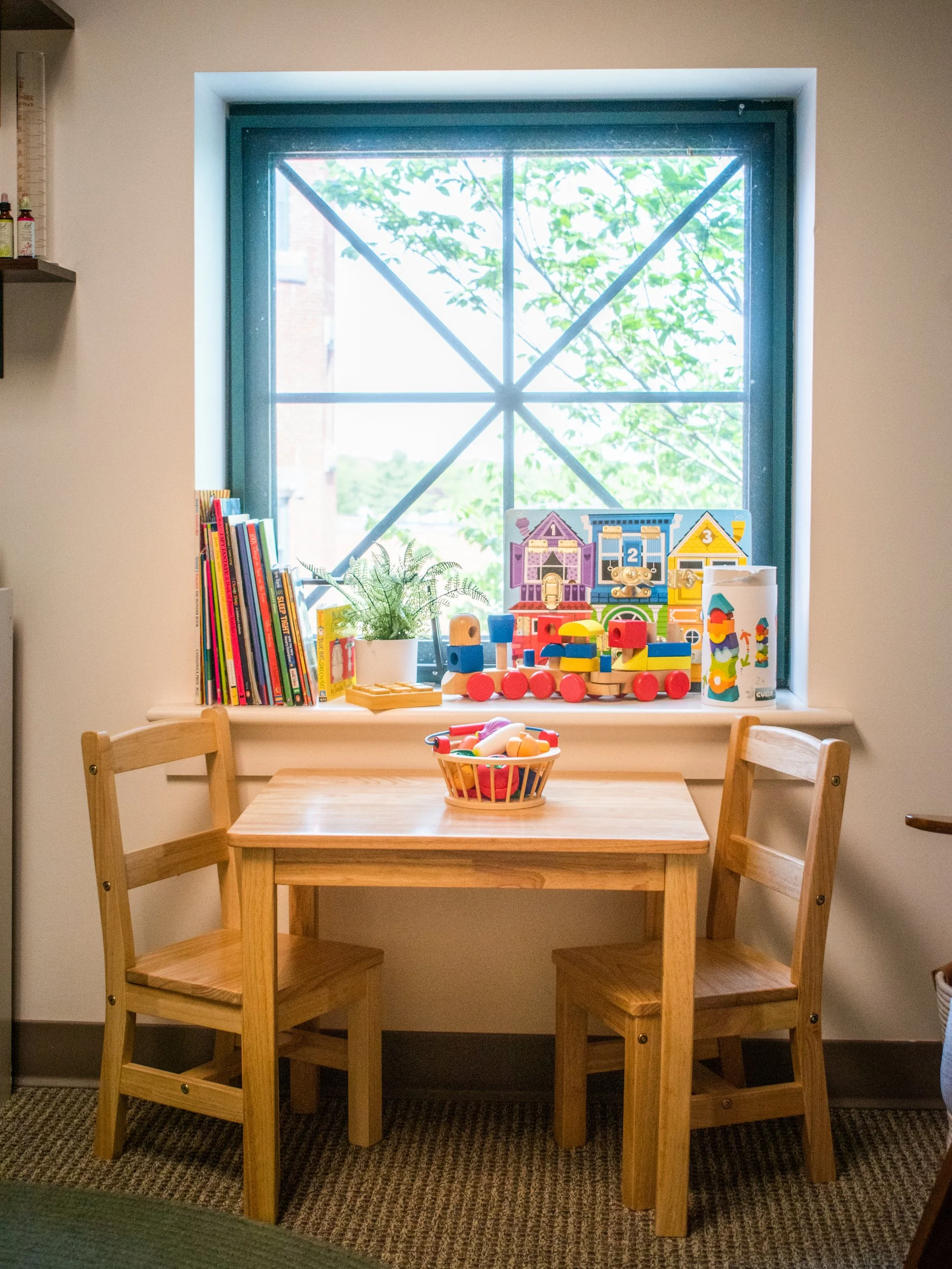
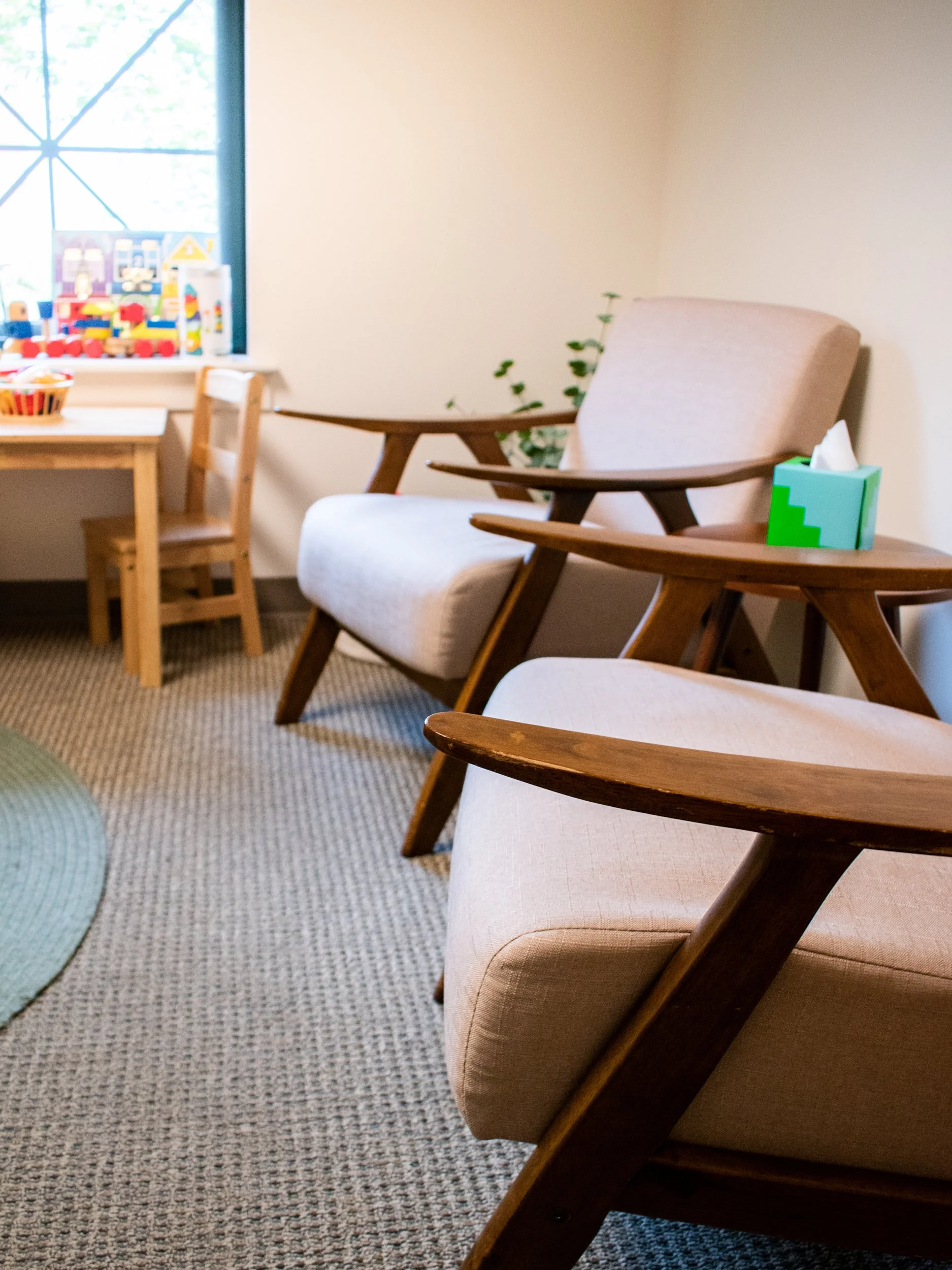
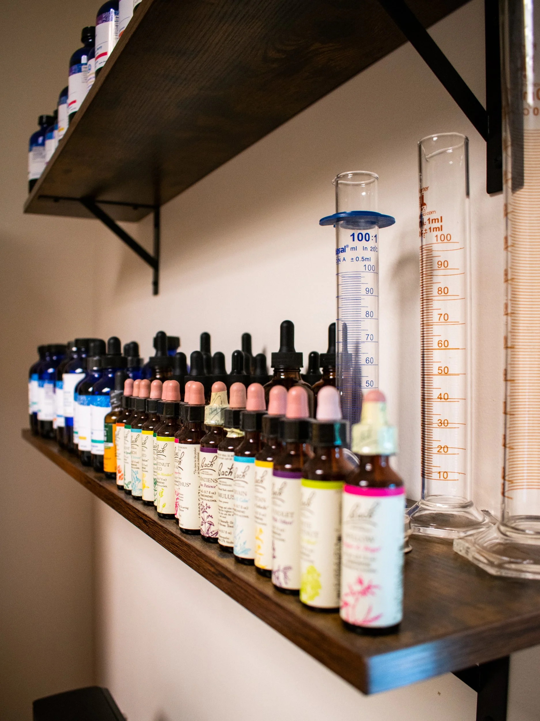
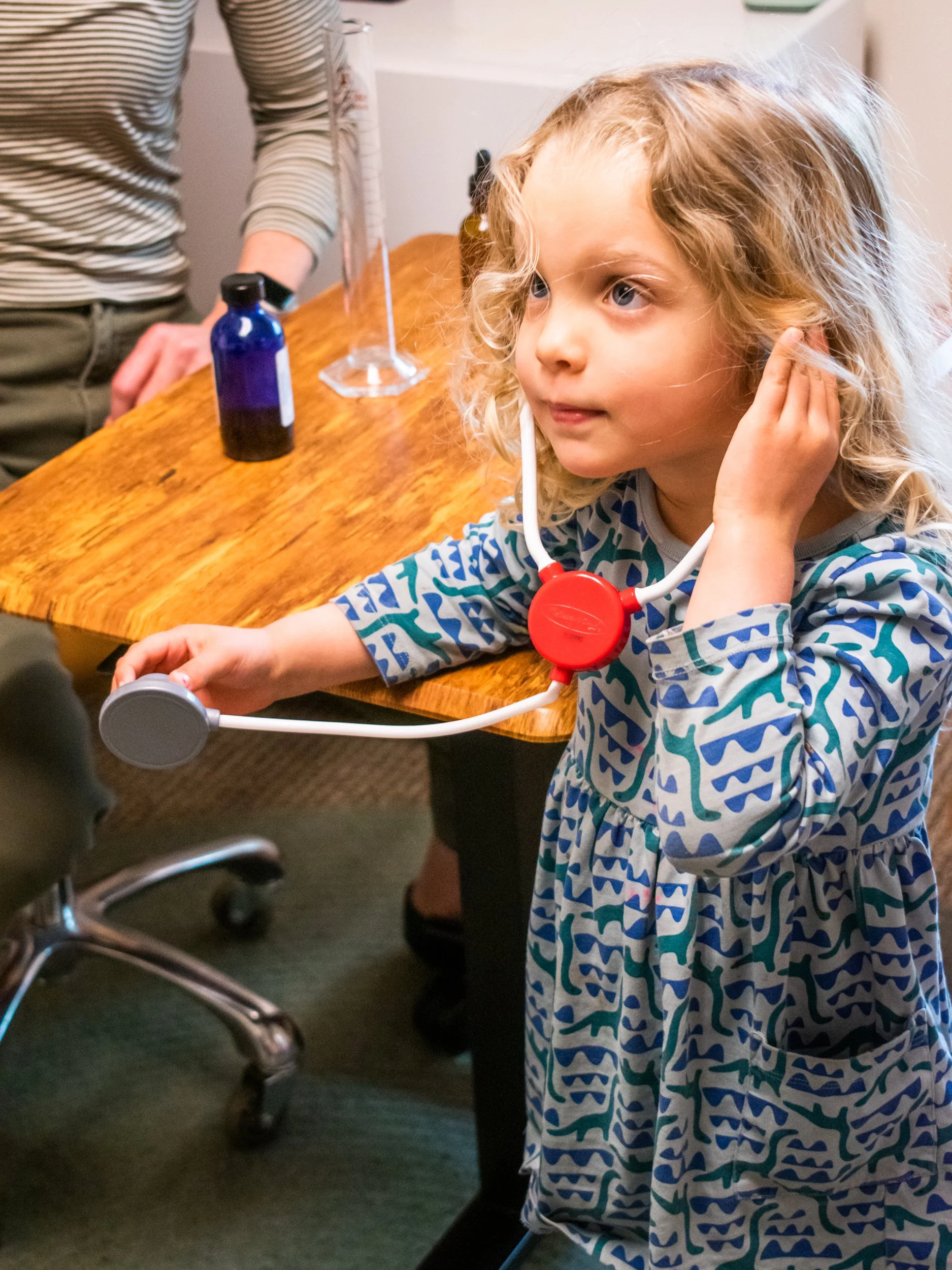
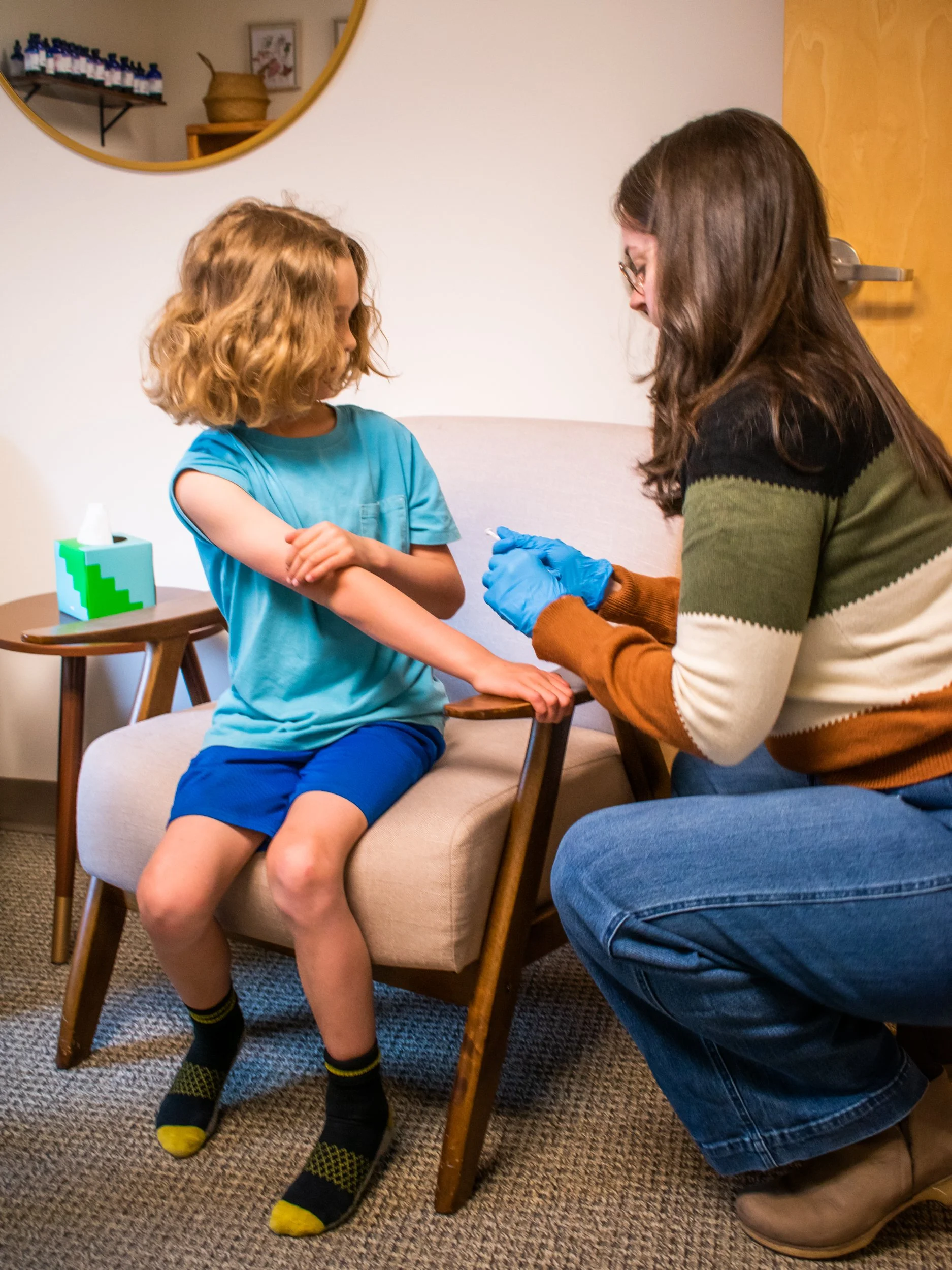
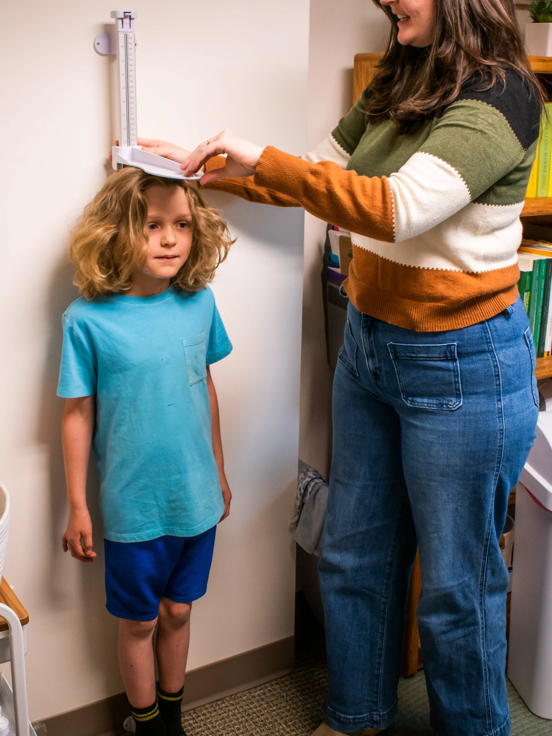
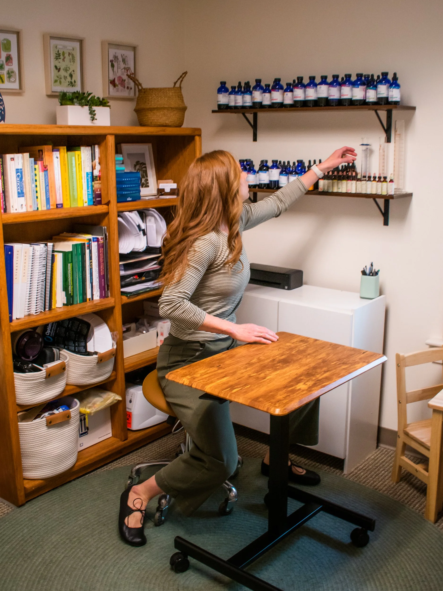
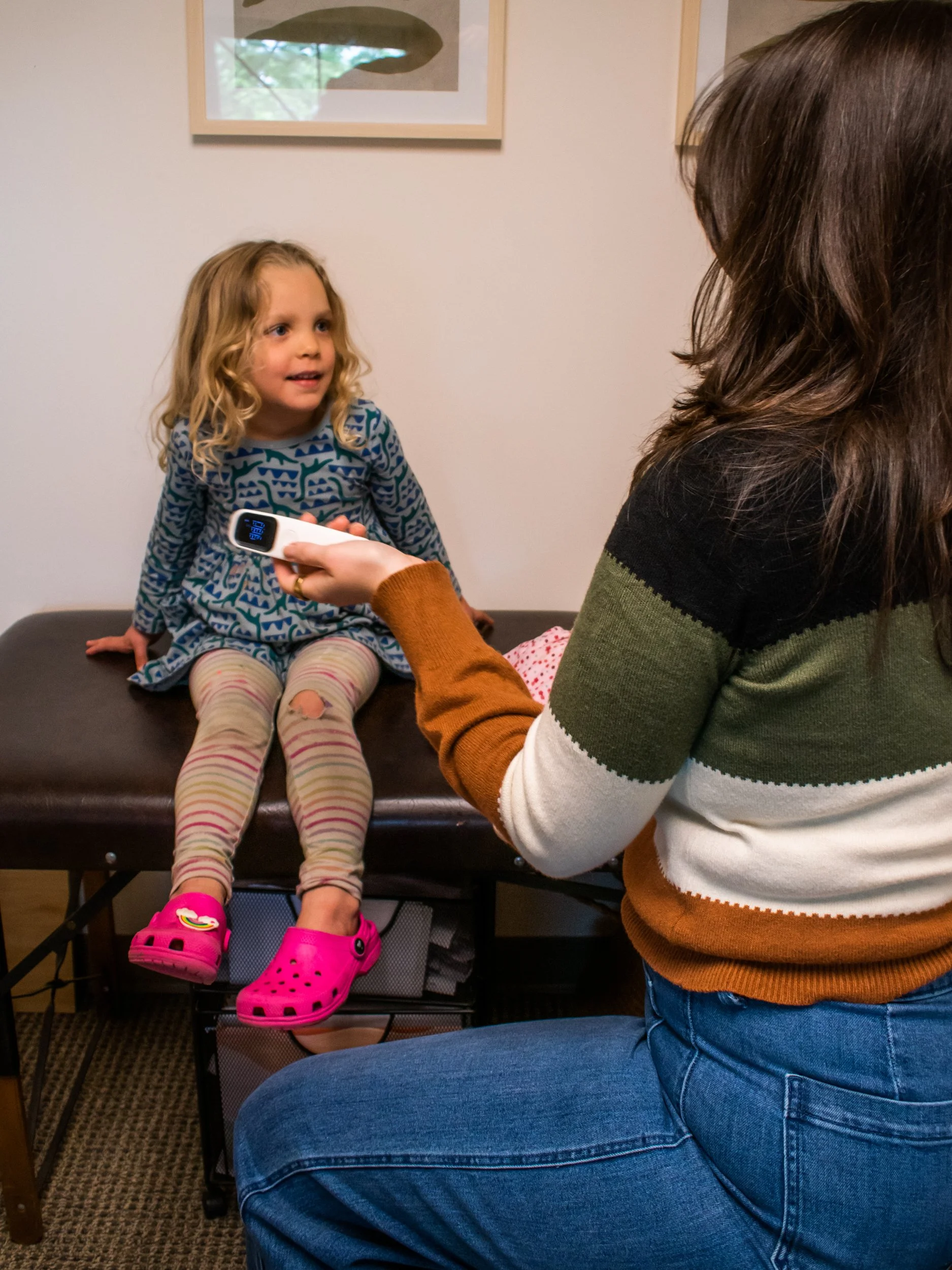
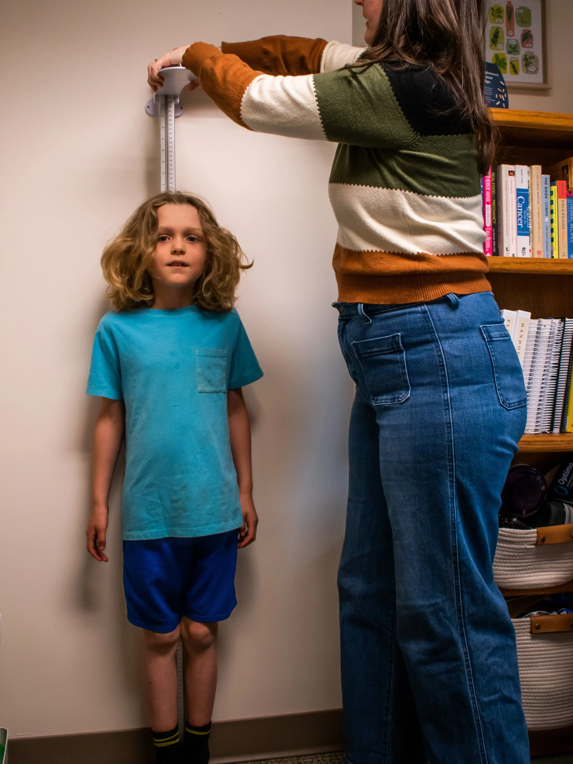
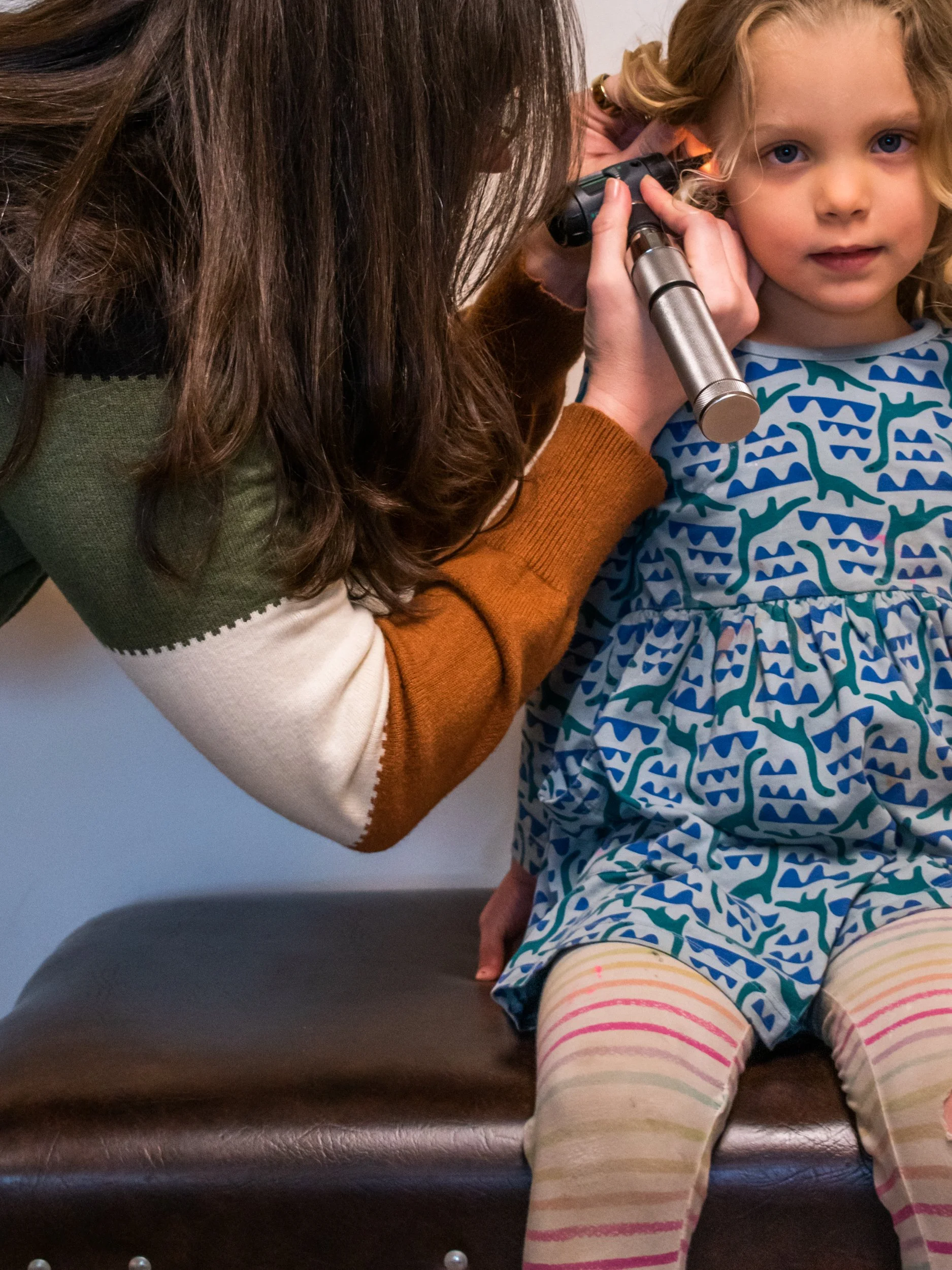
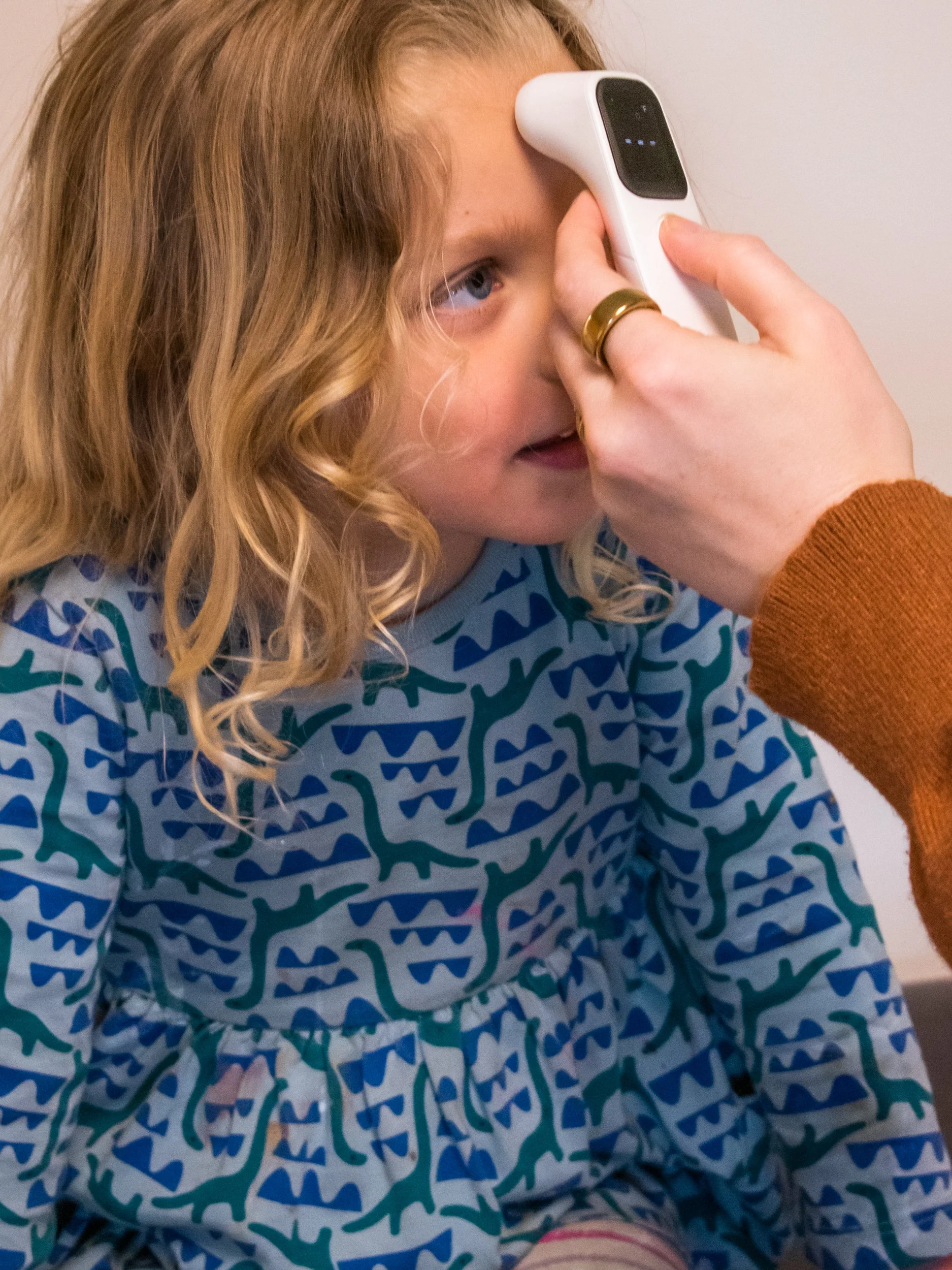
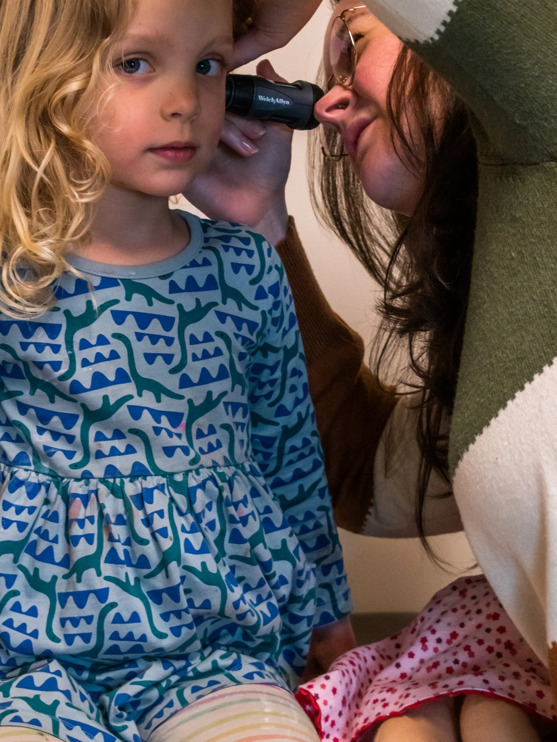
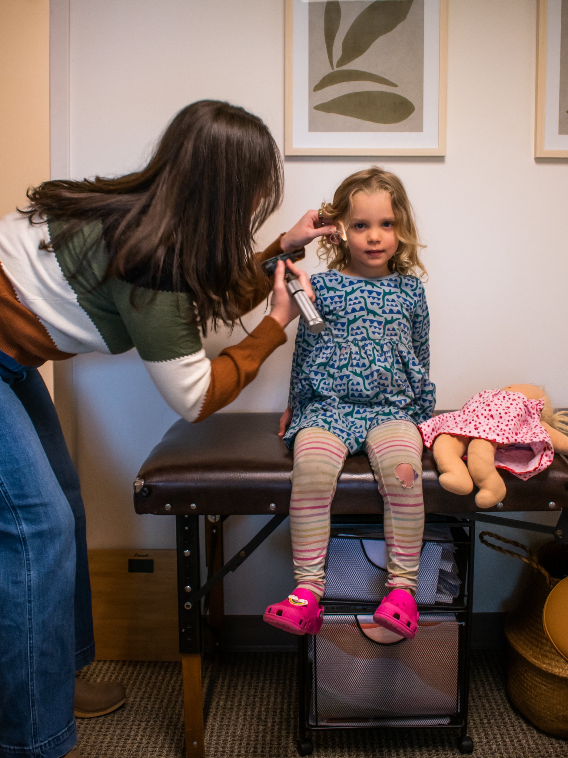
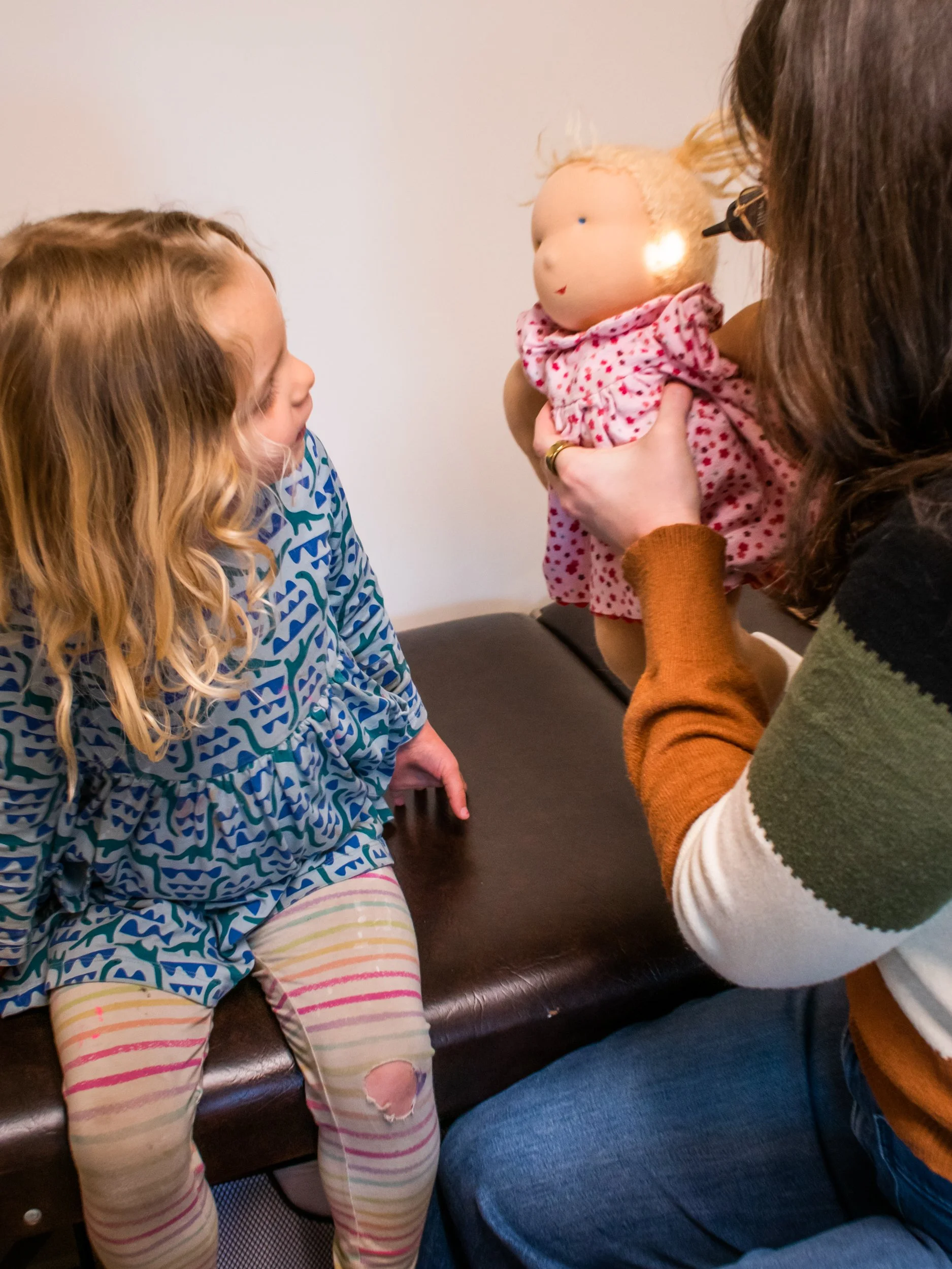
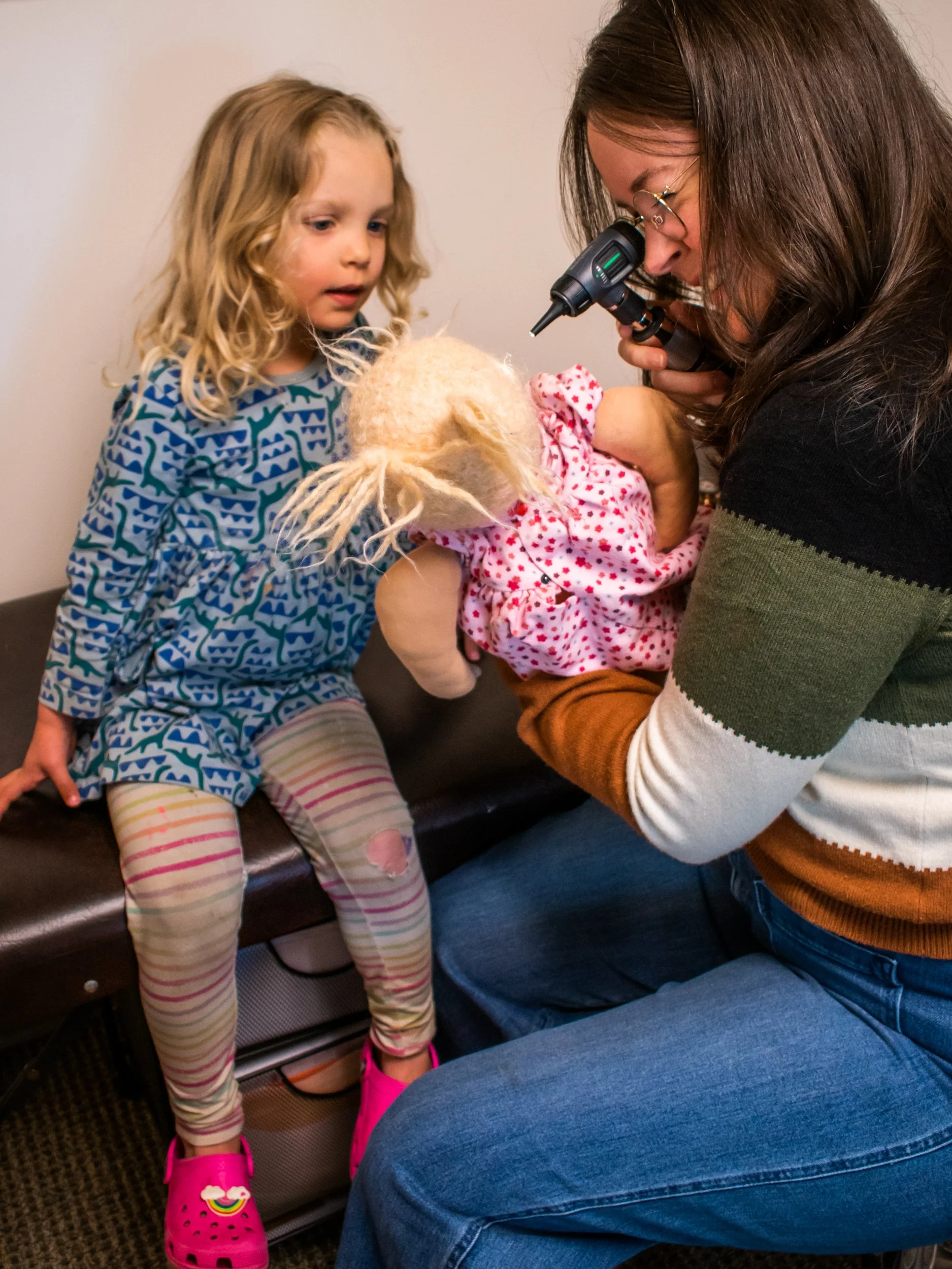
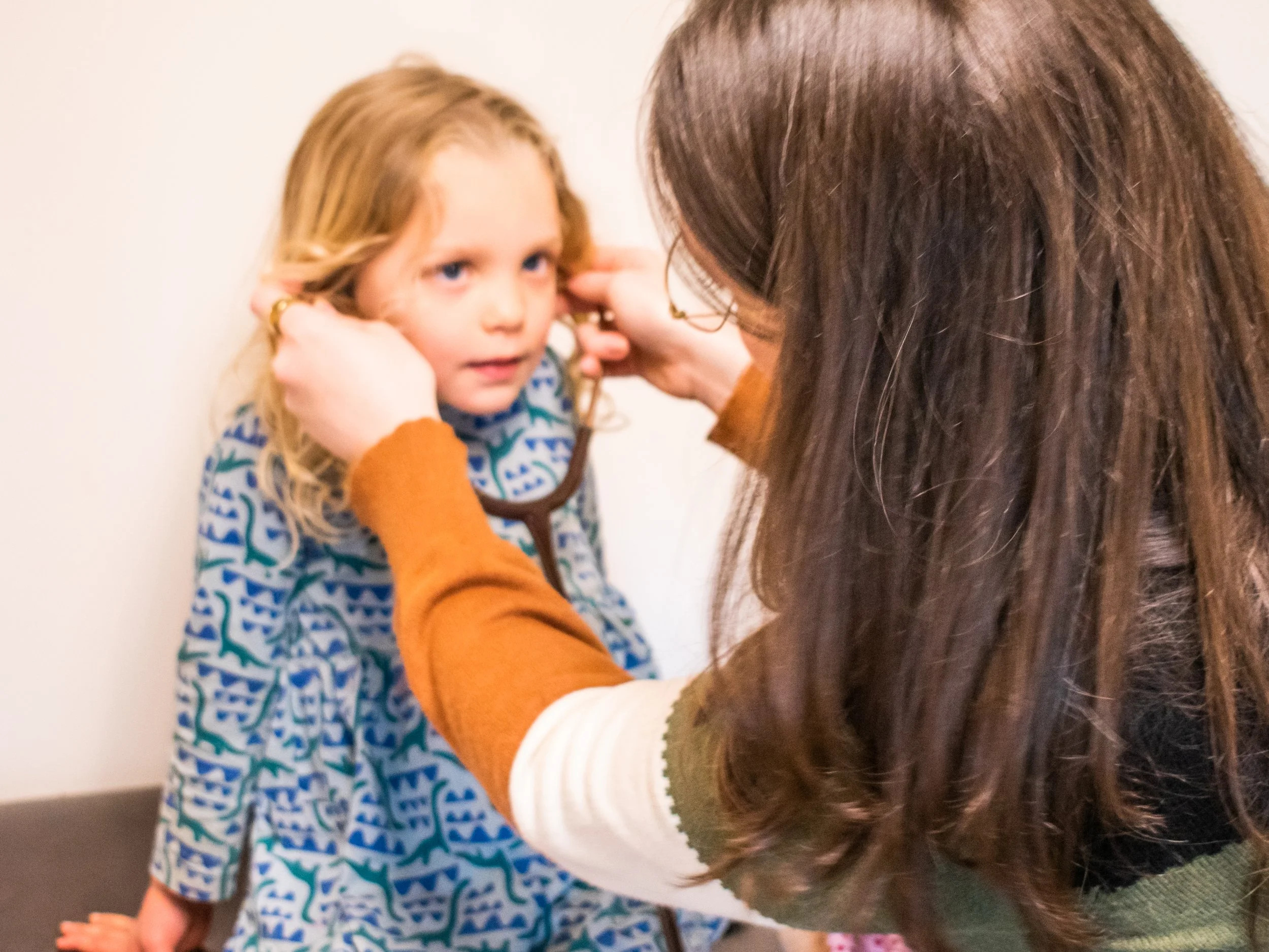
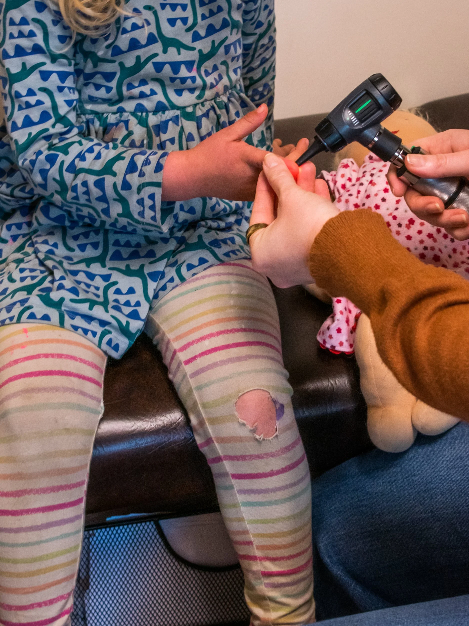
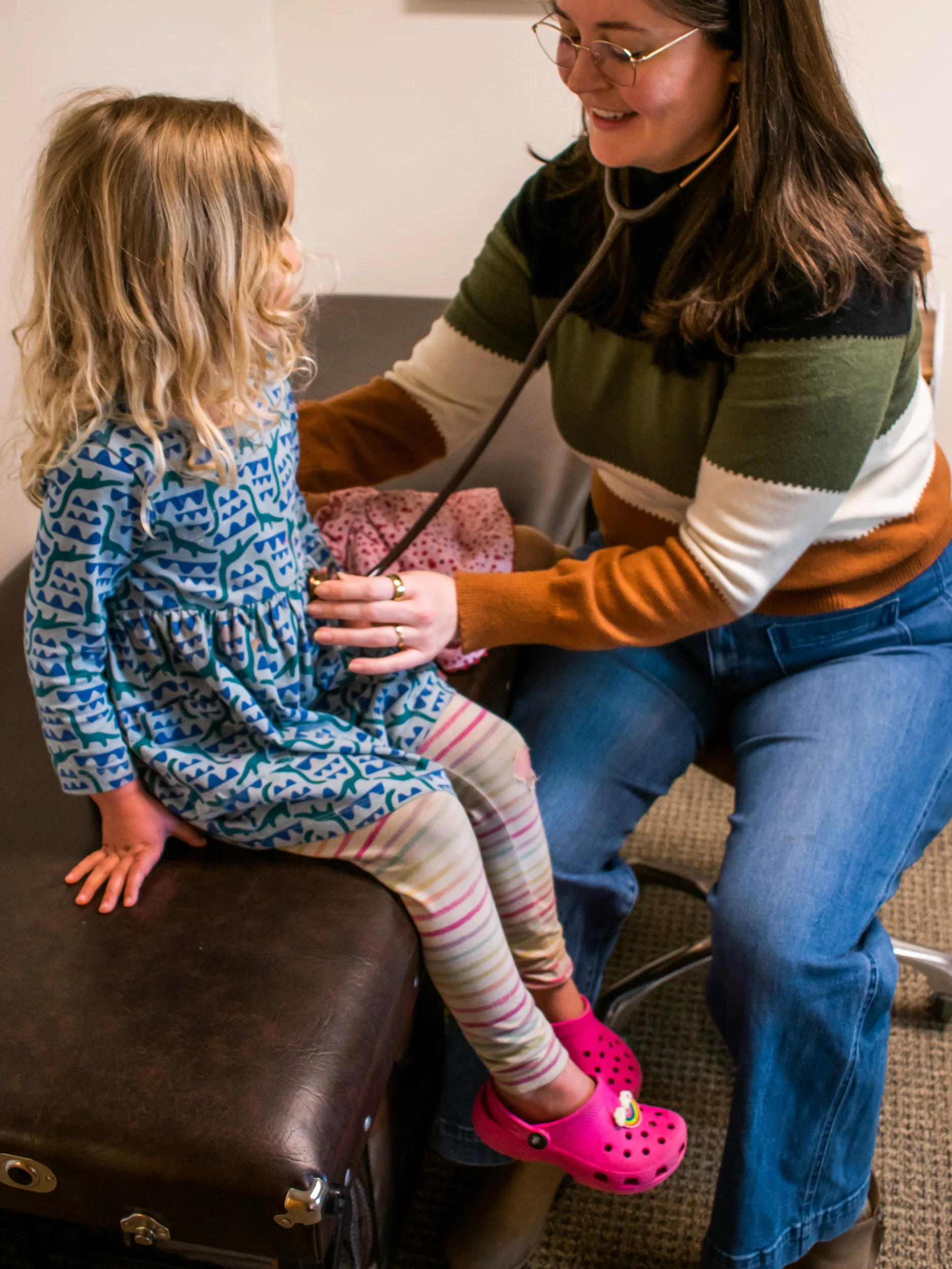
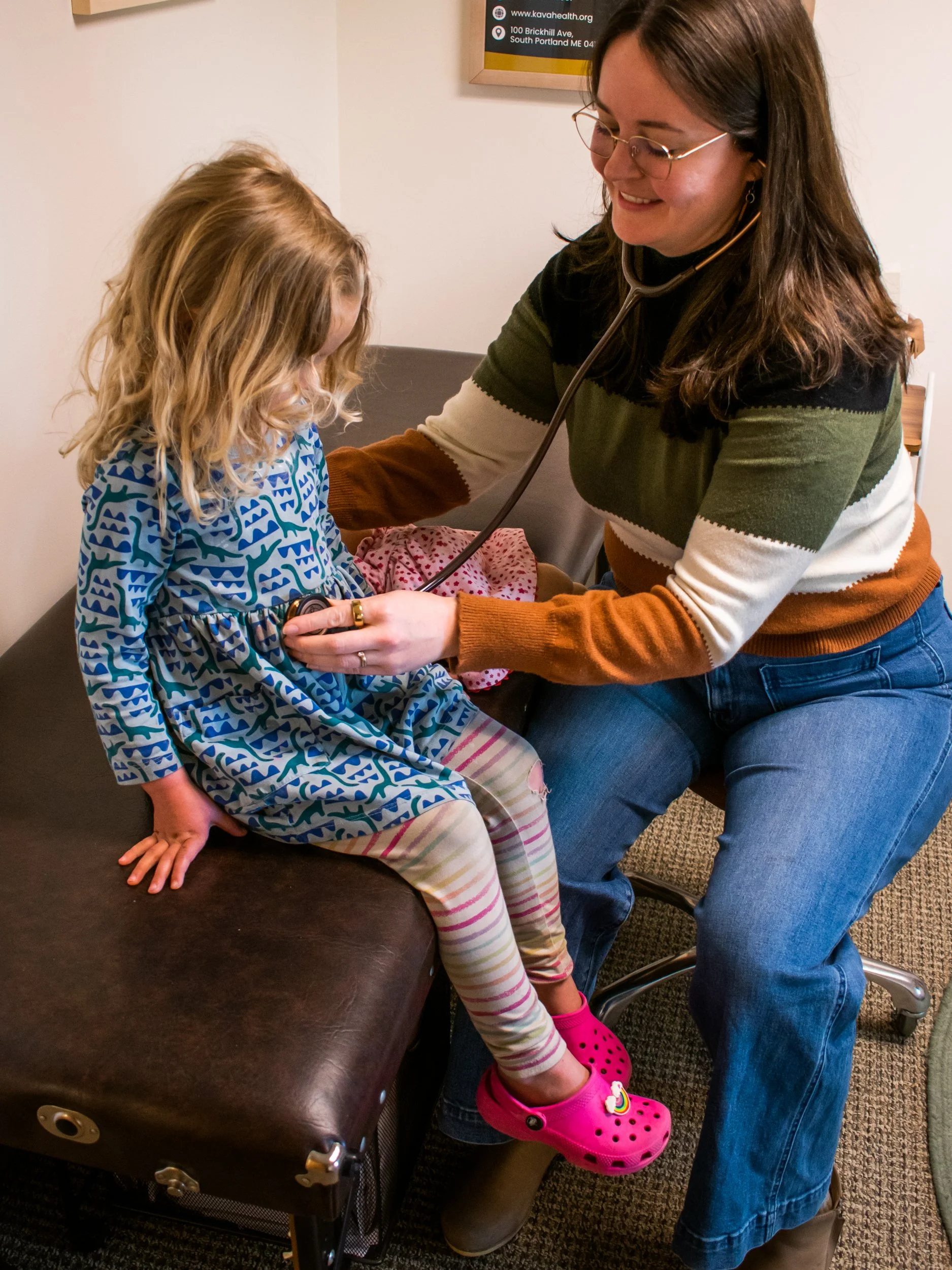
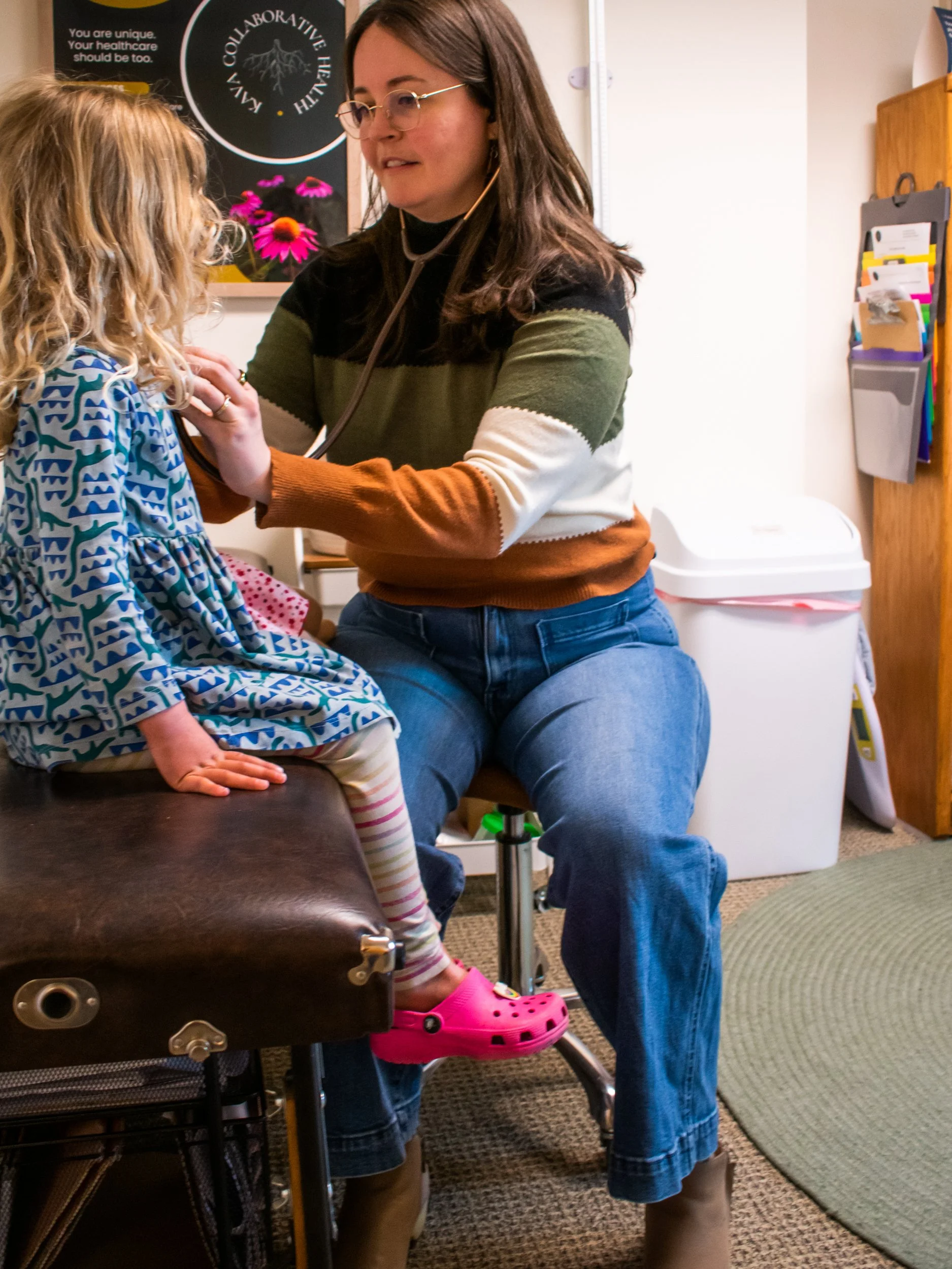
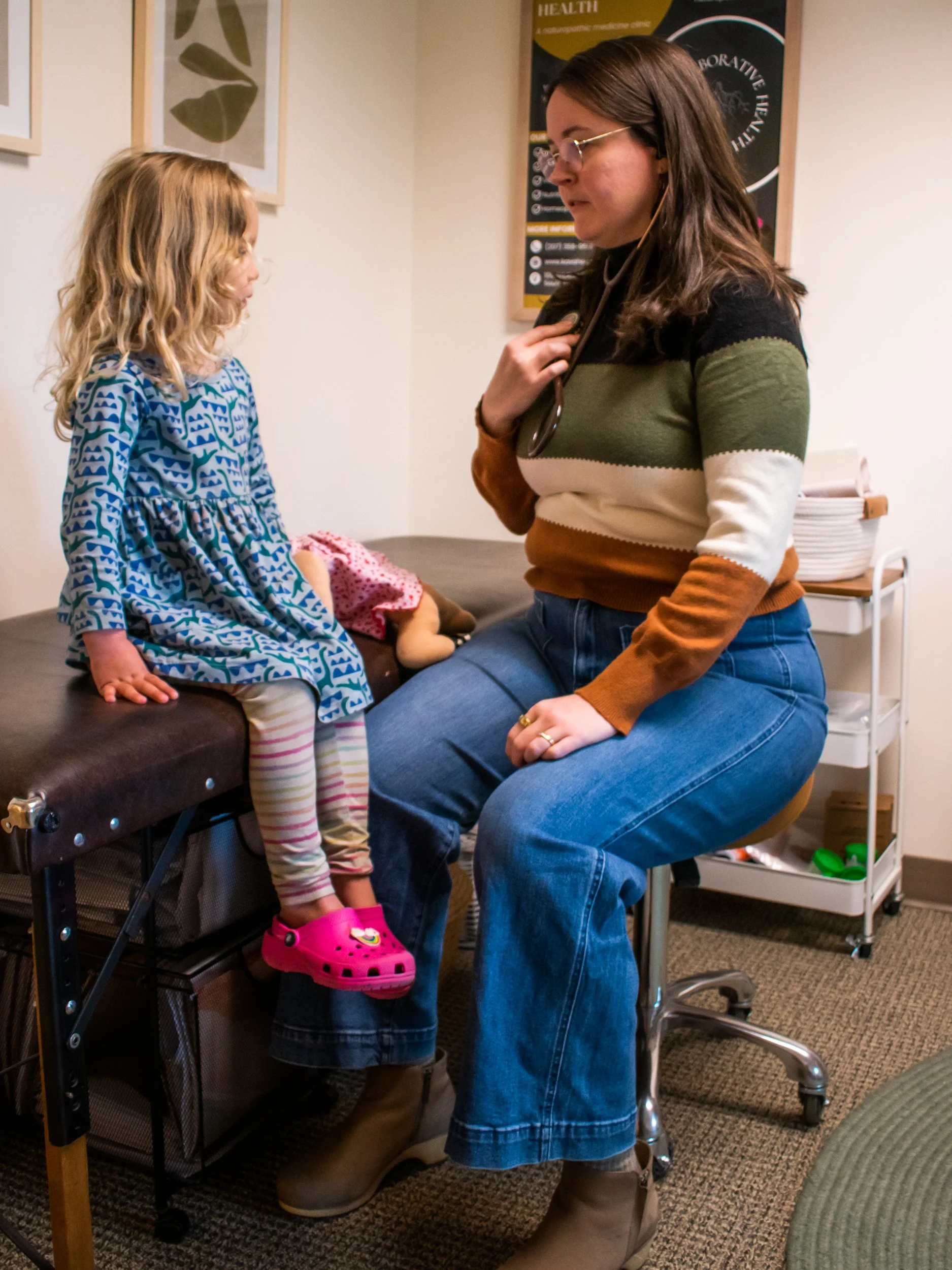
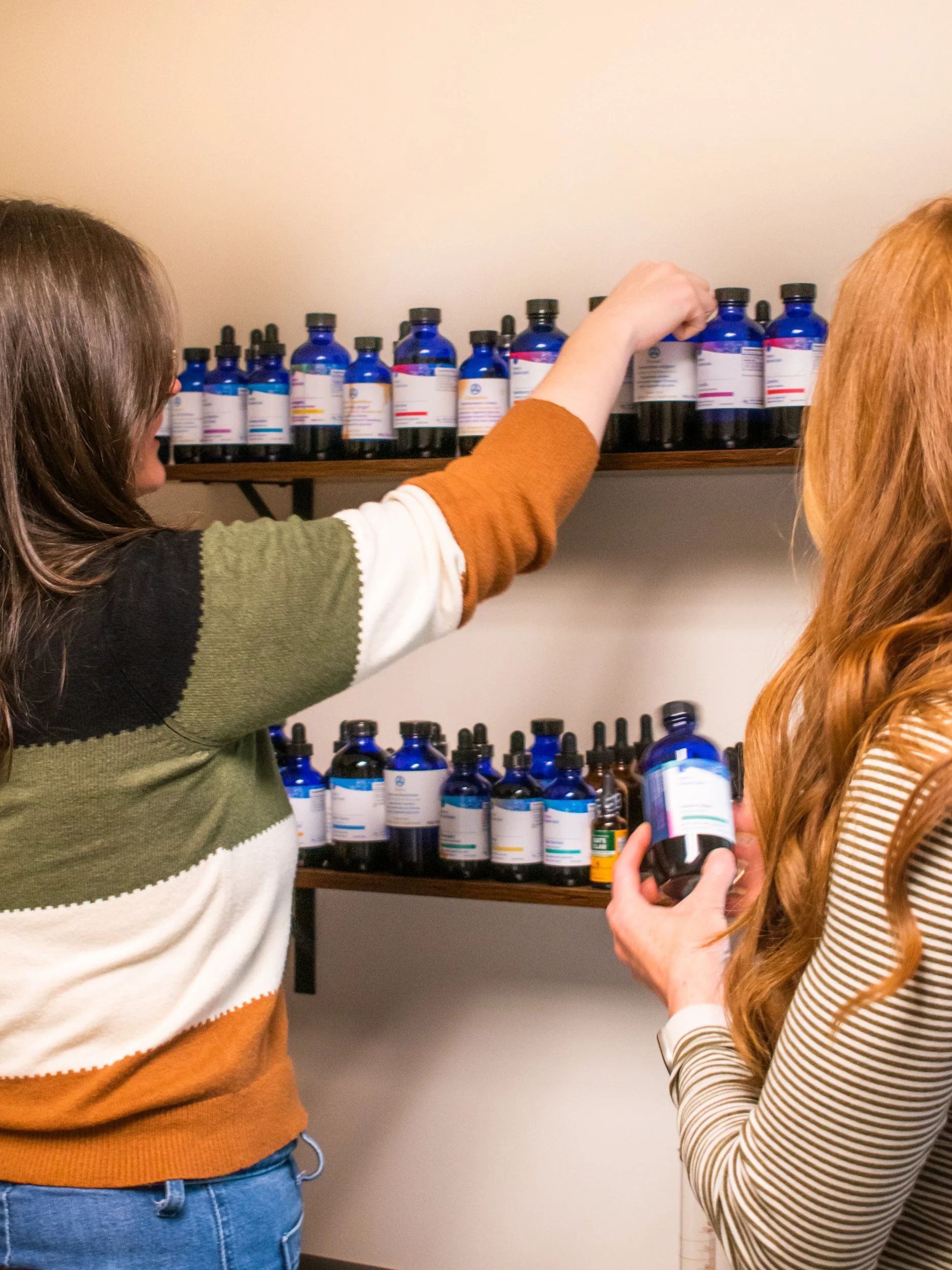
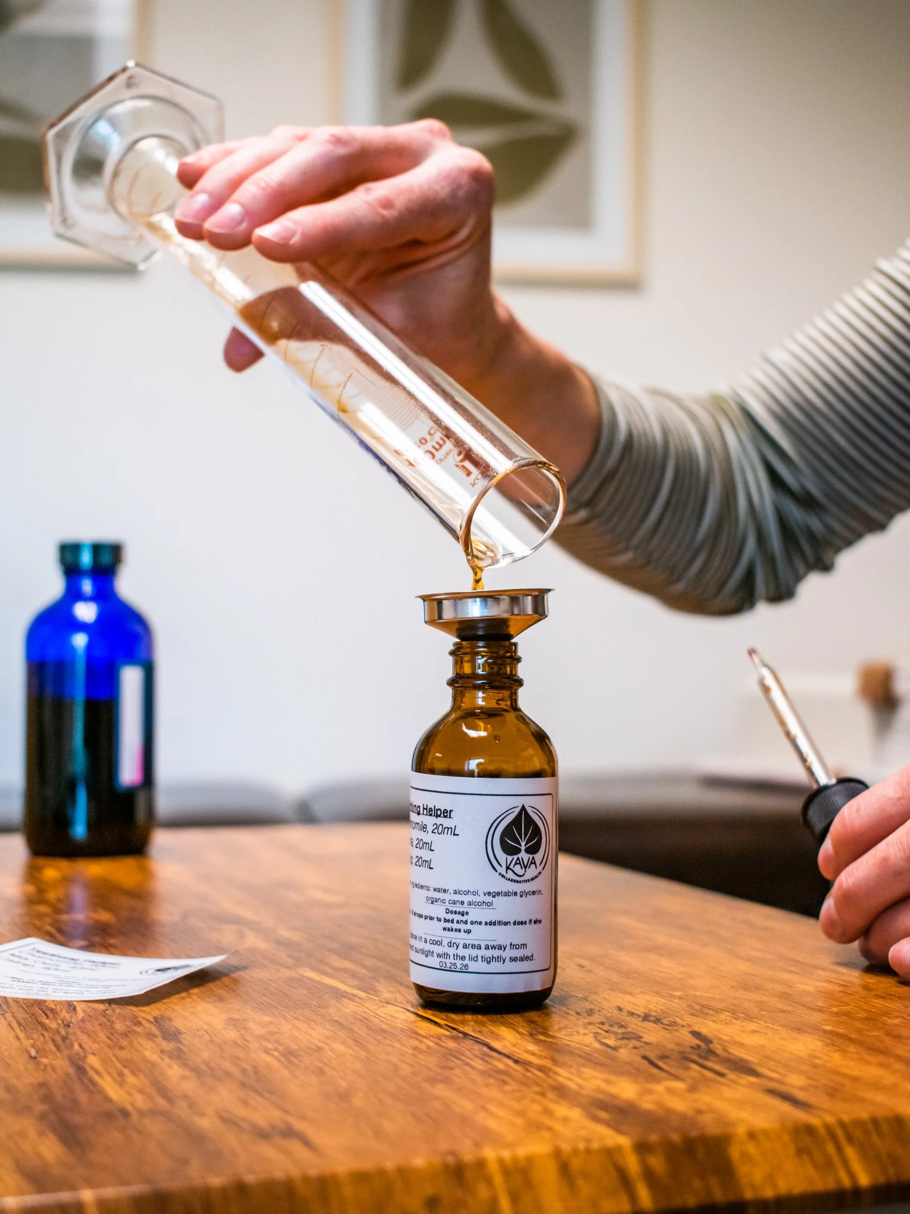
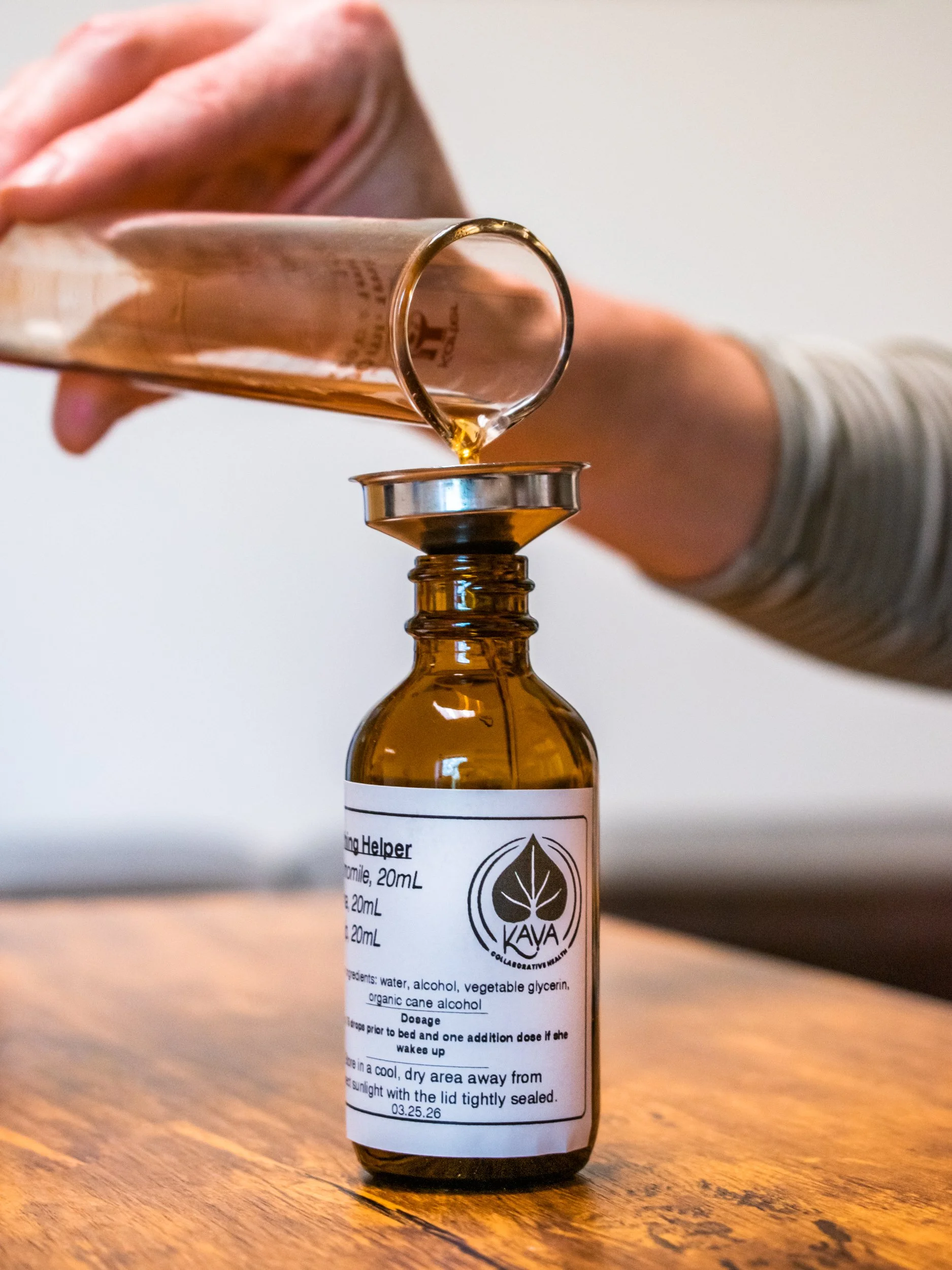
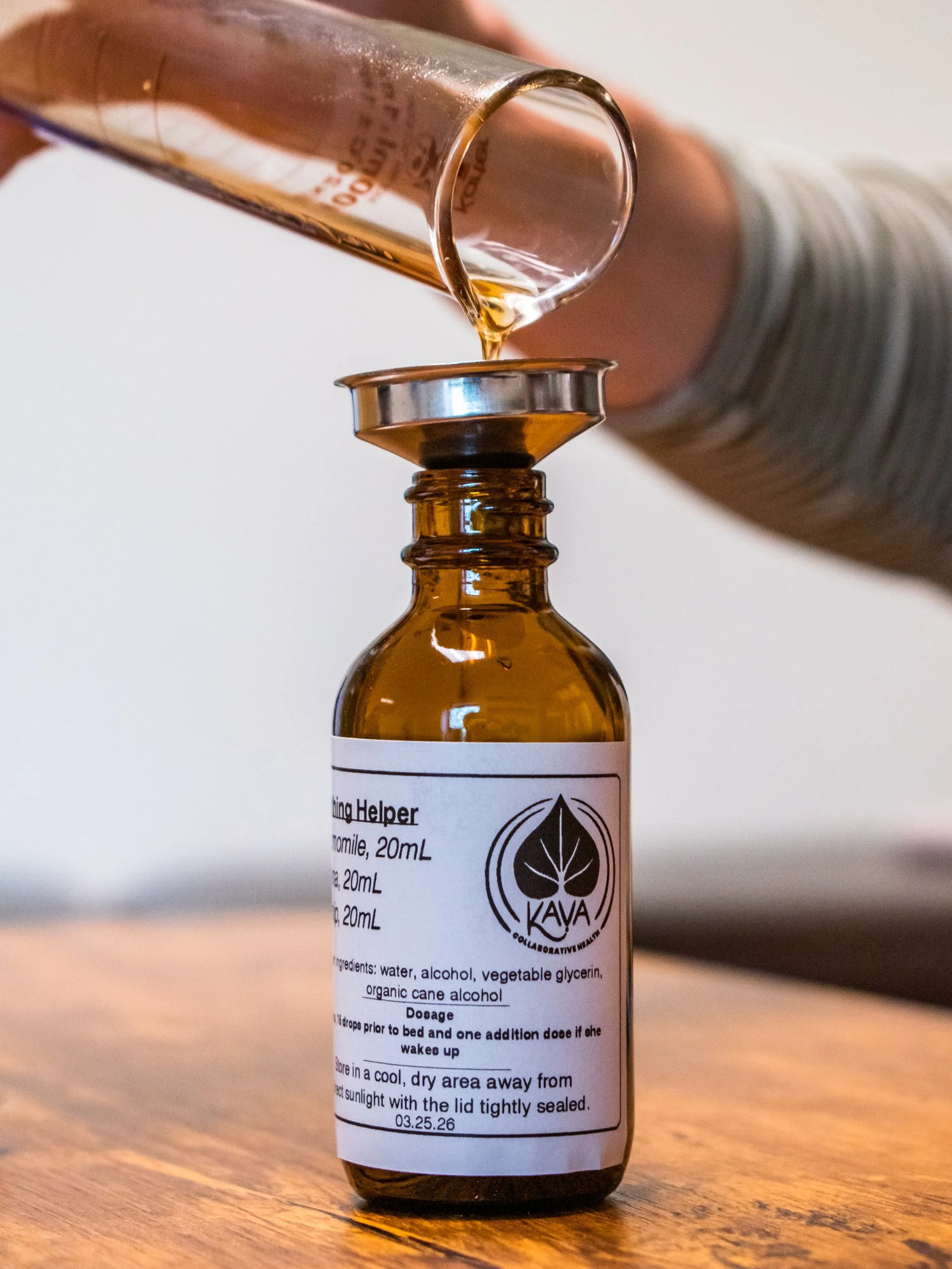
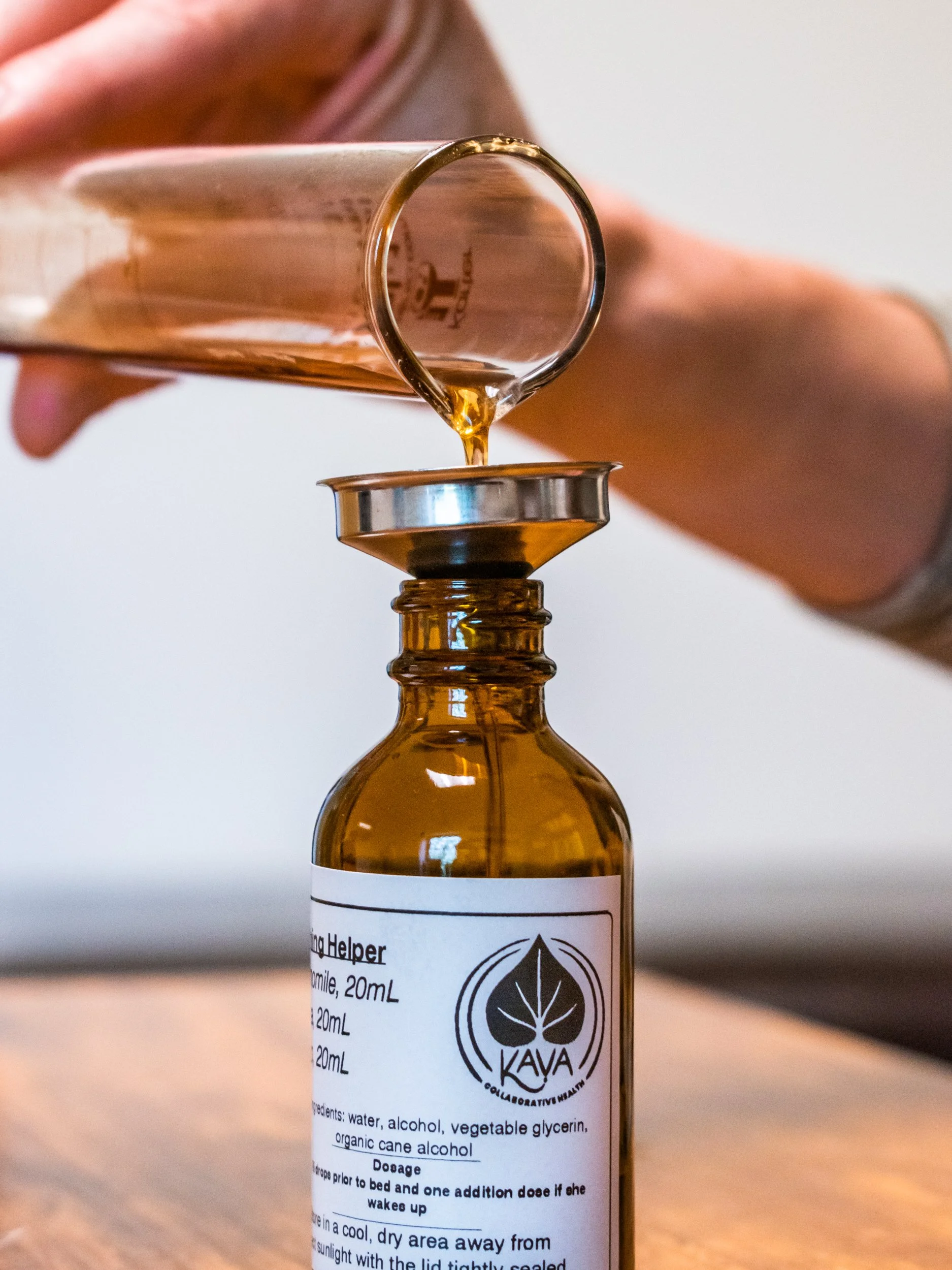
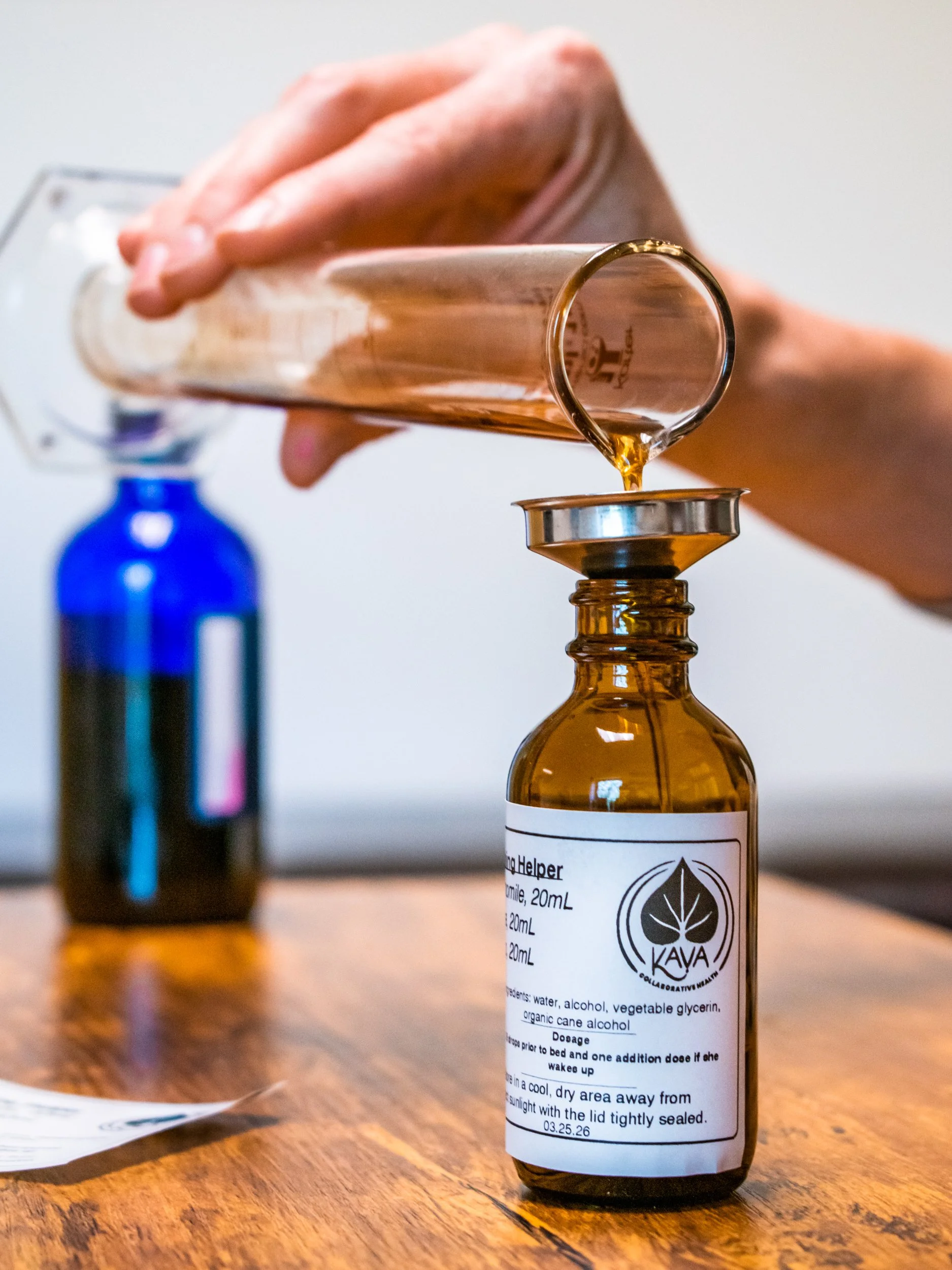
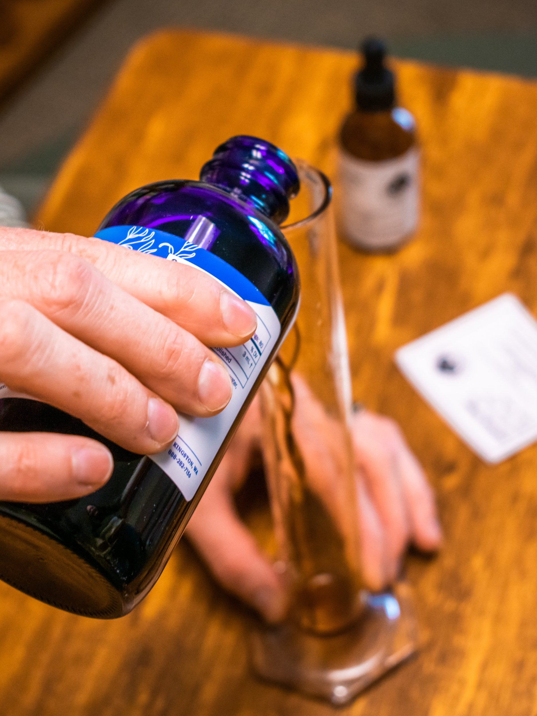
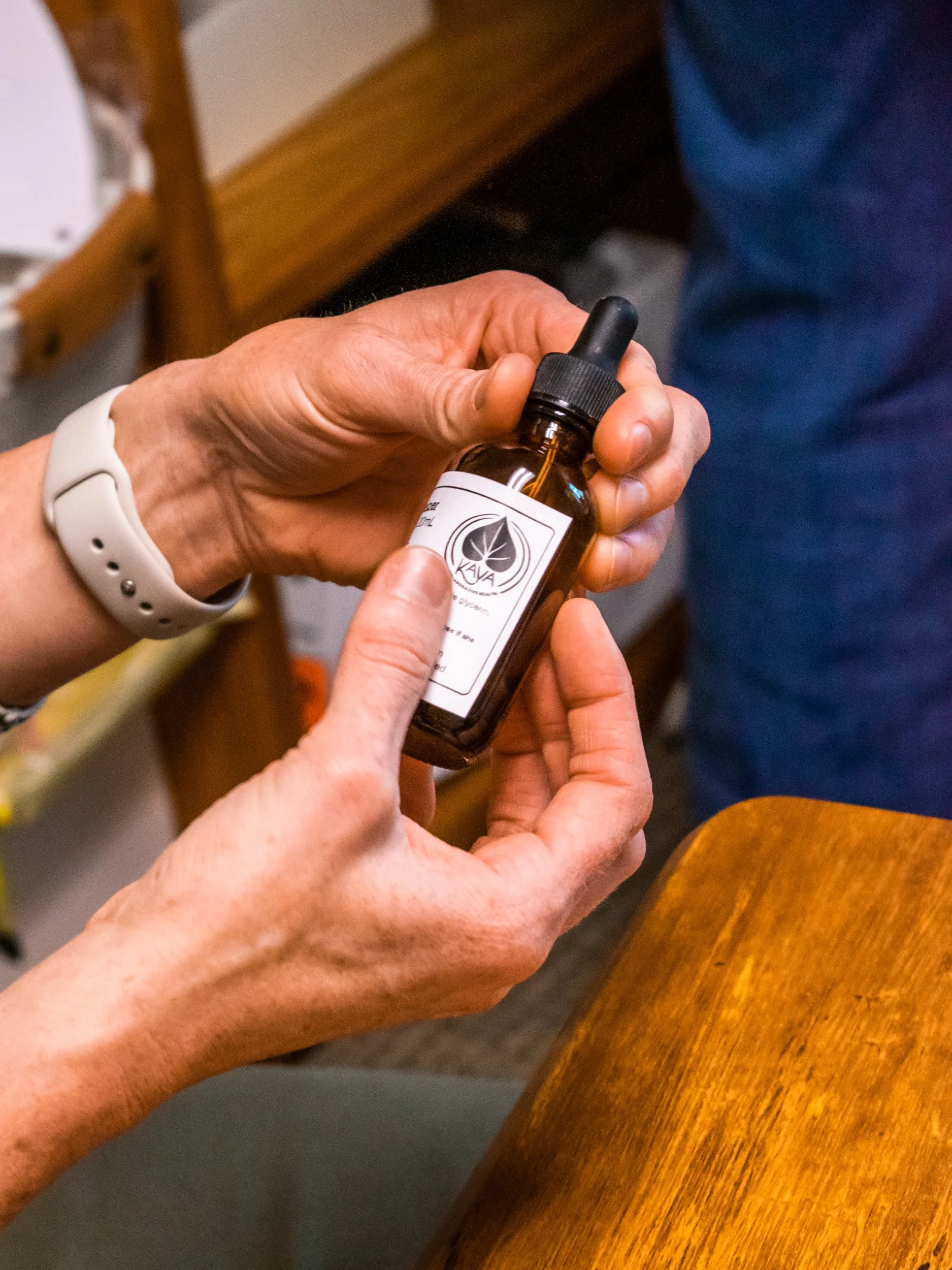
Photography
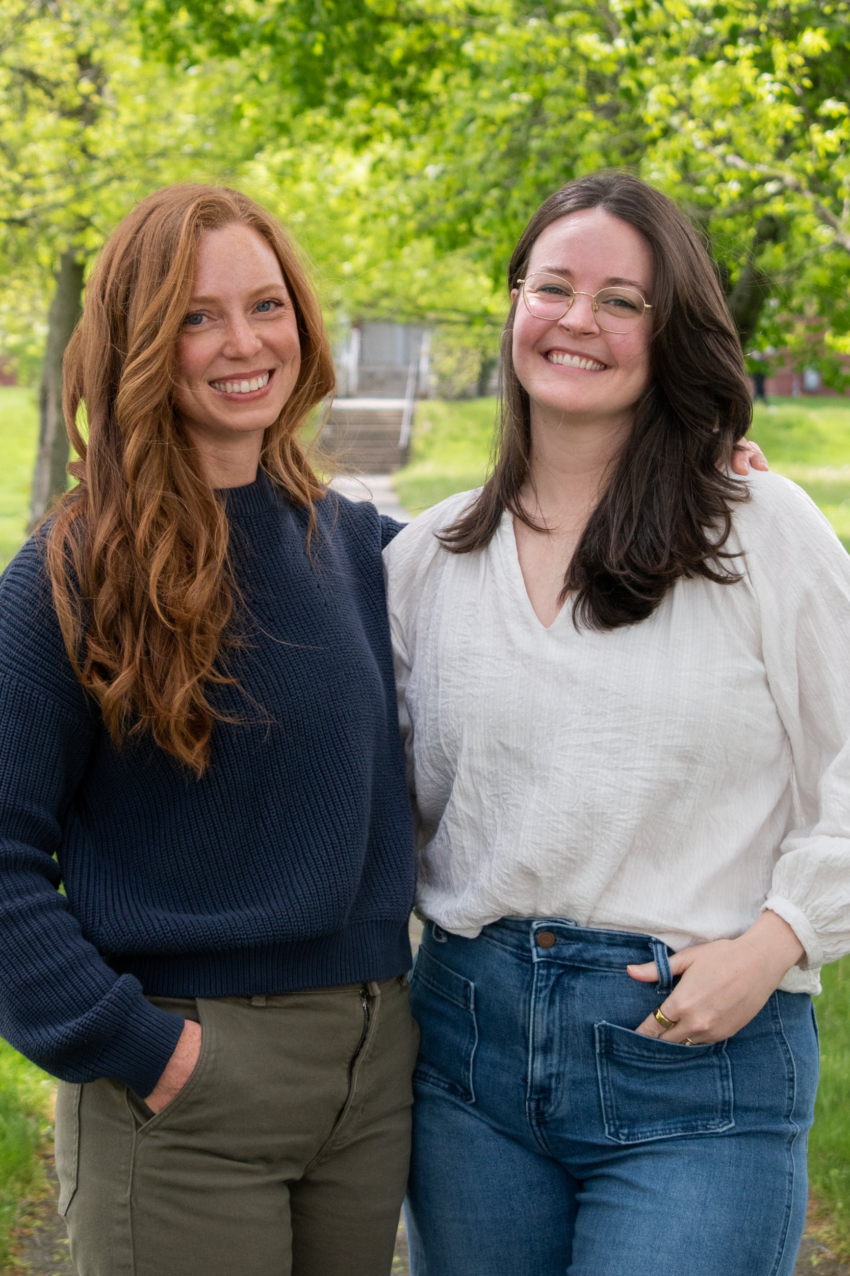
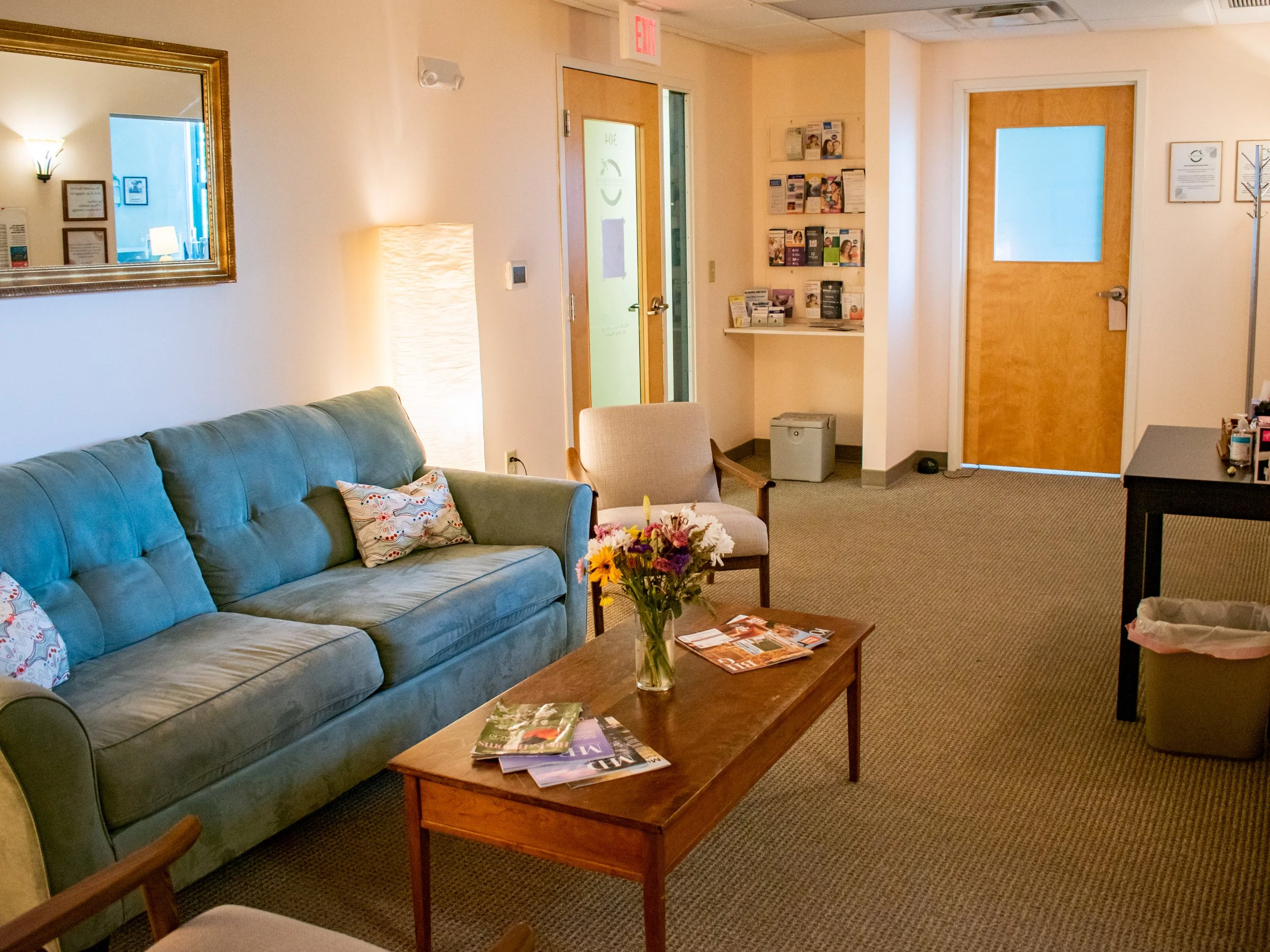
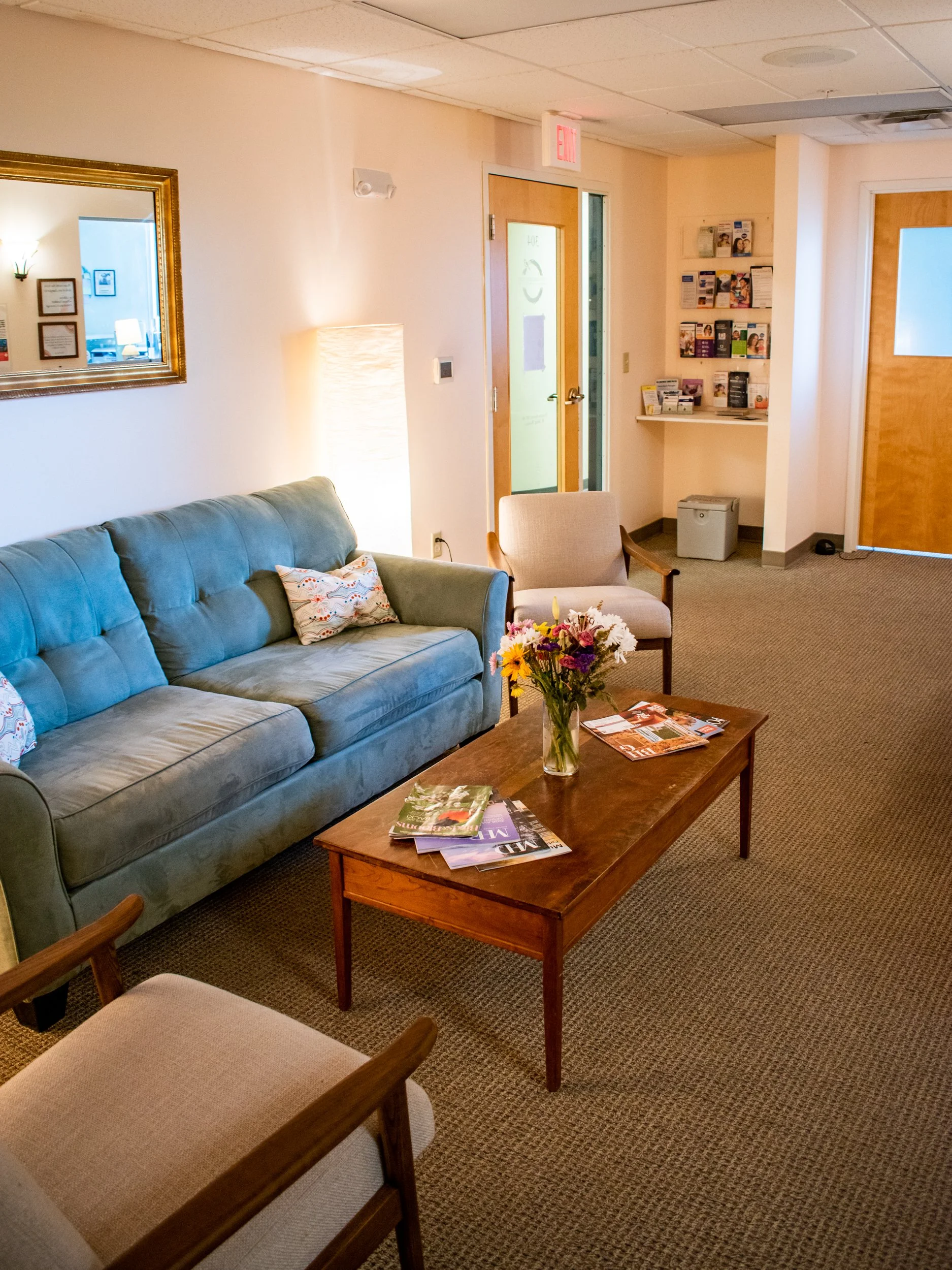
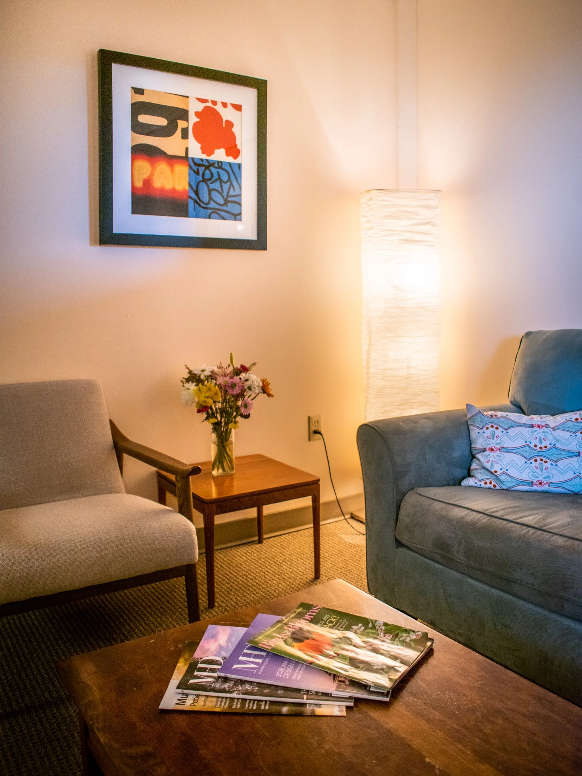
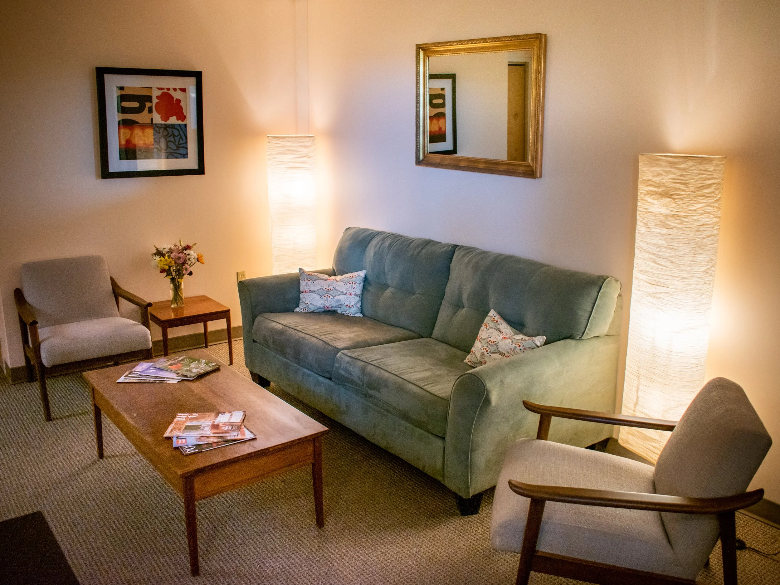
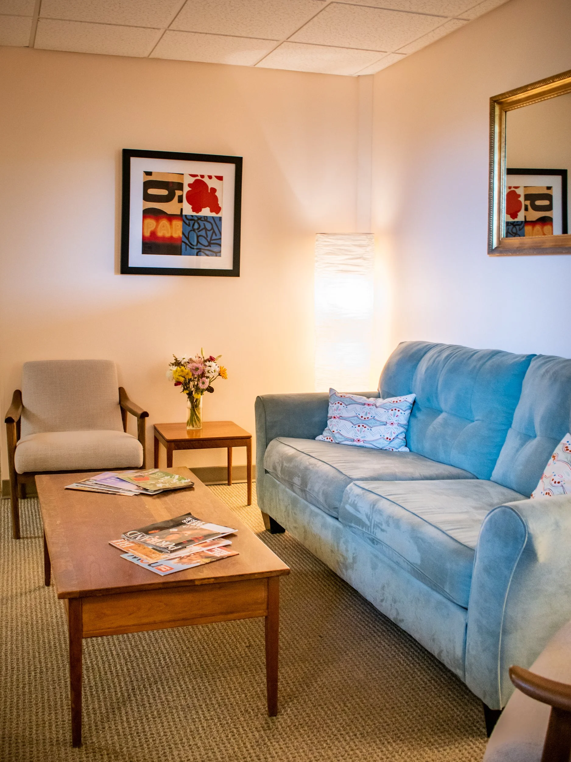
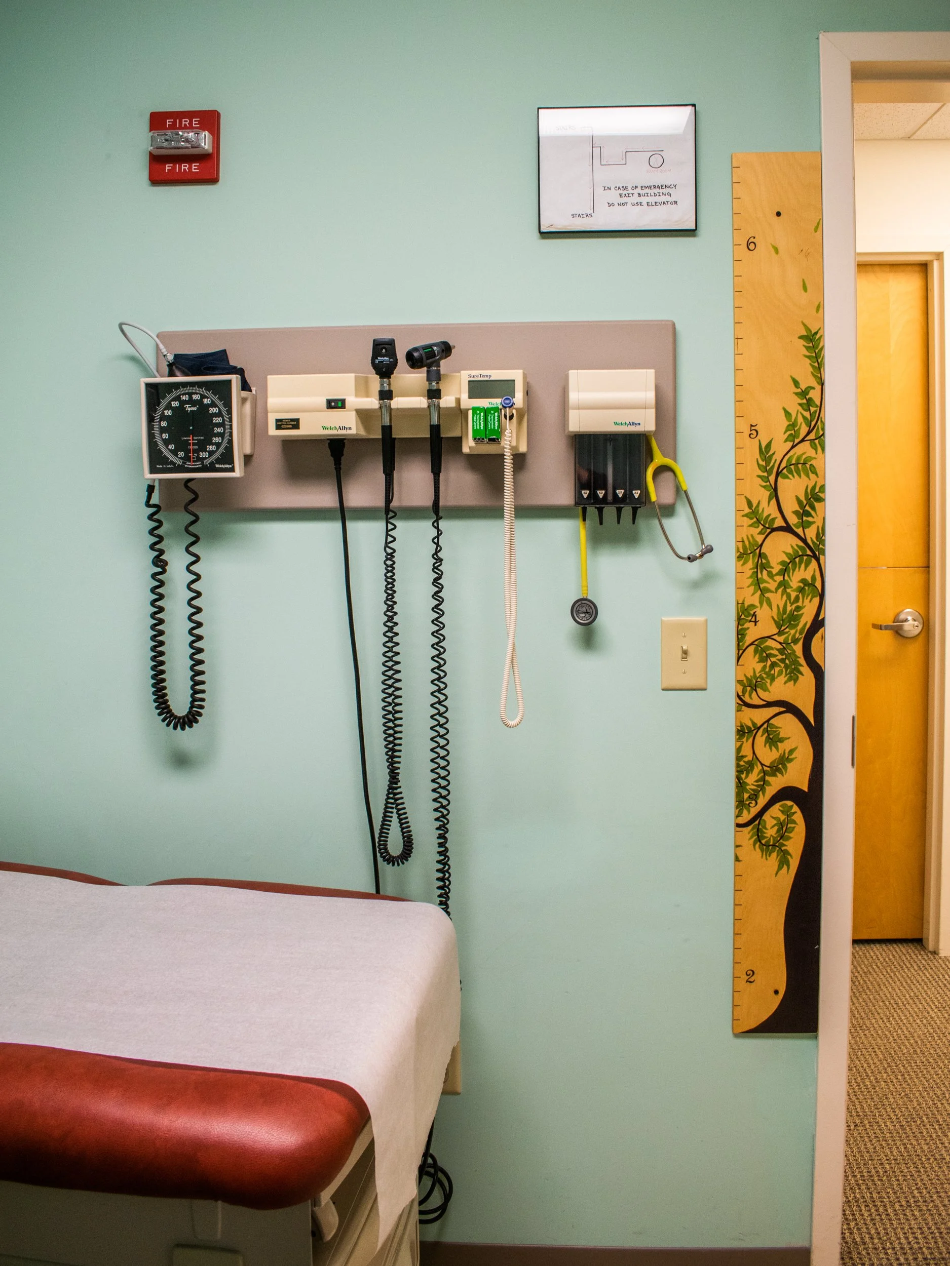
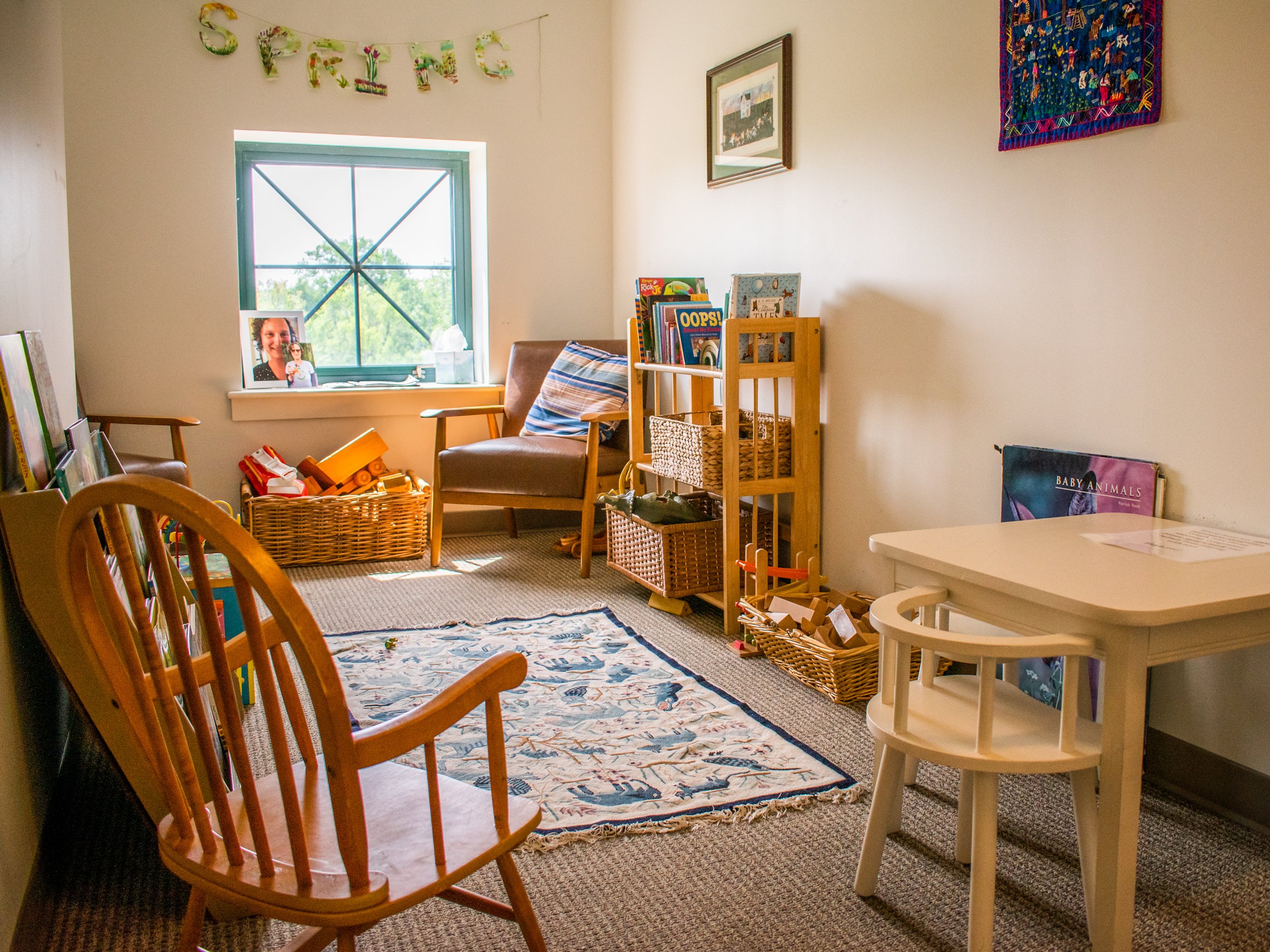
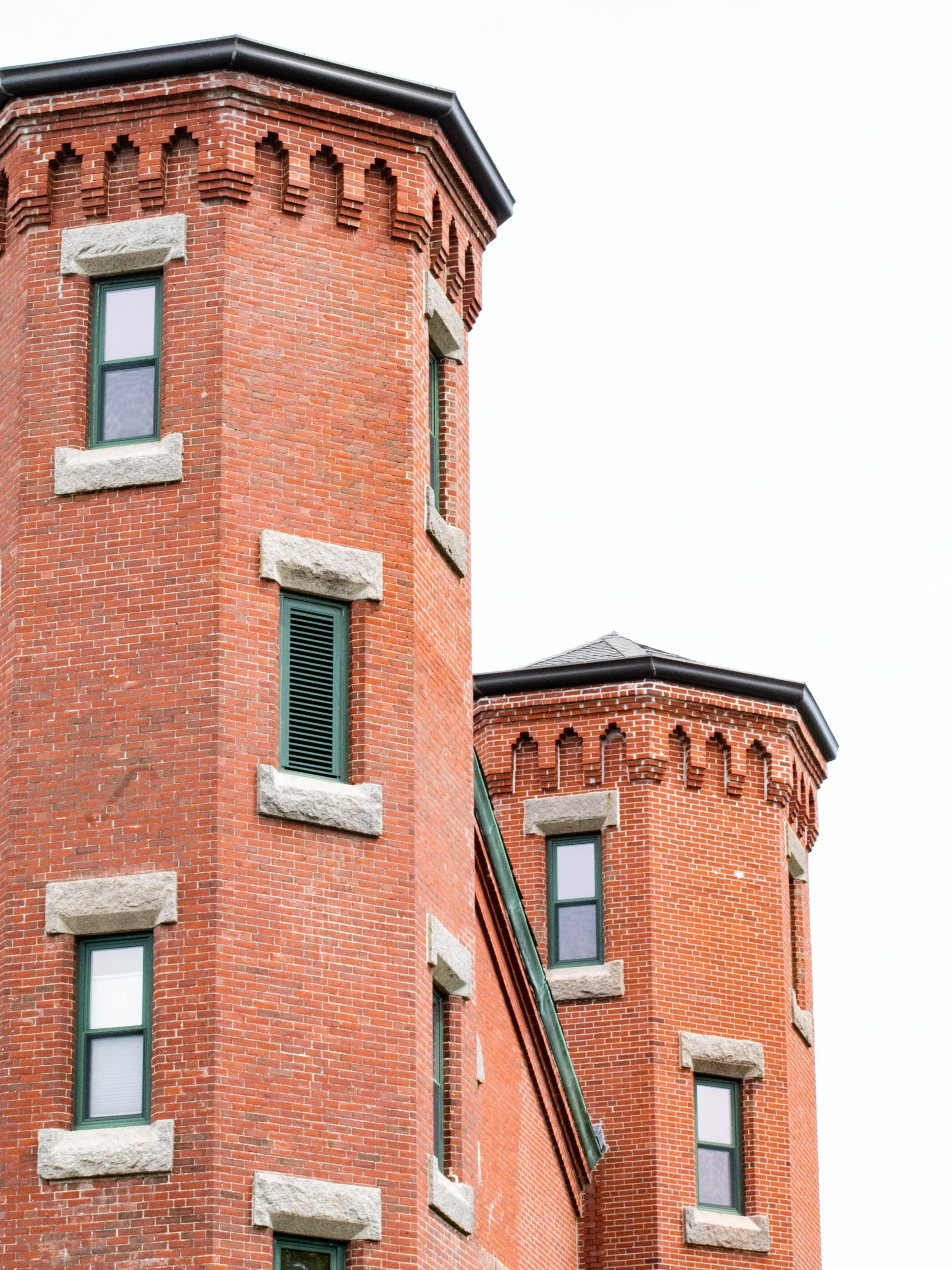
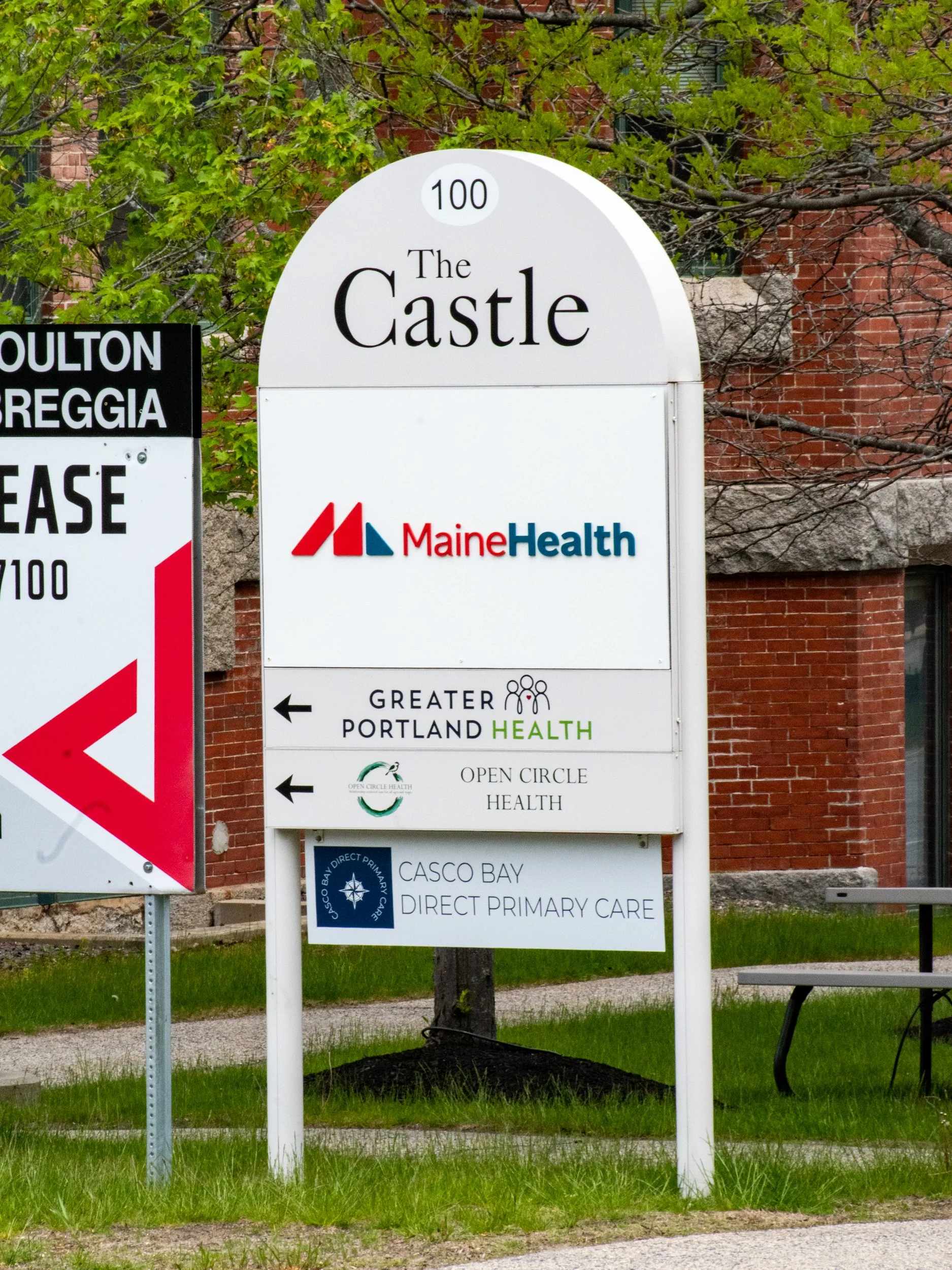
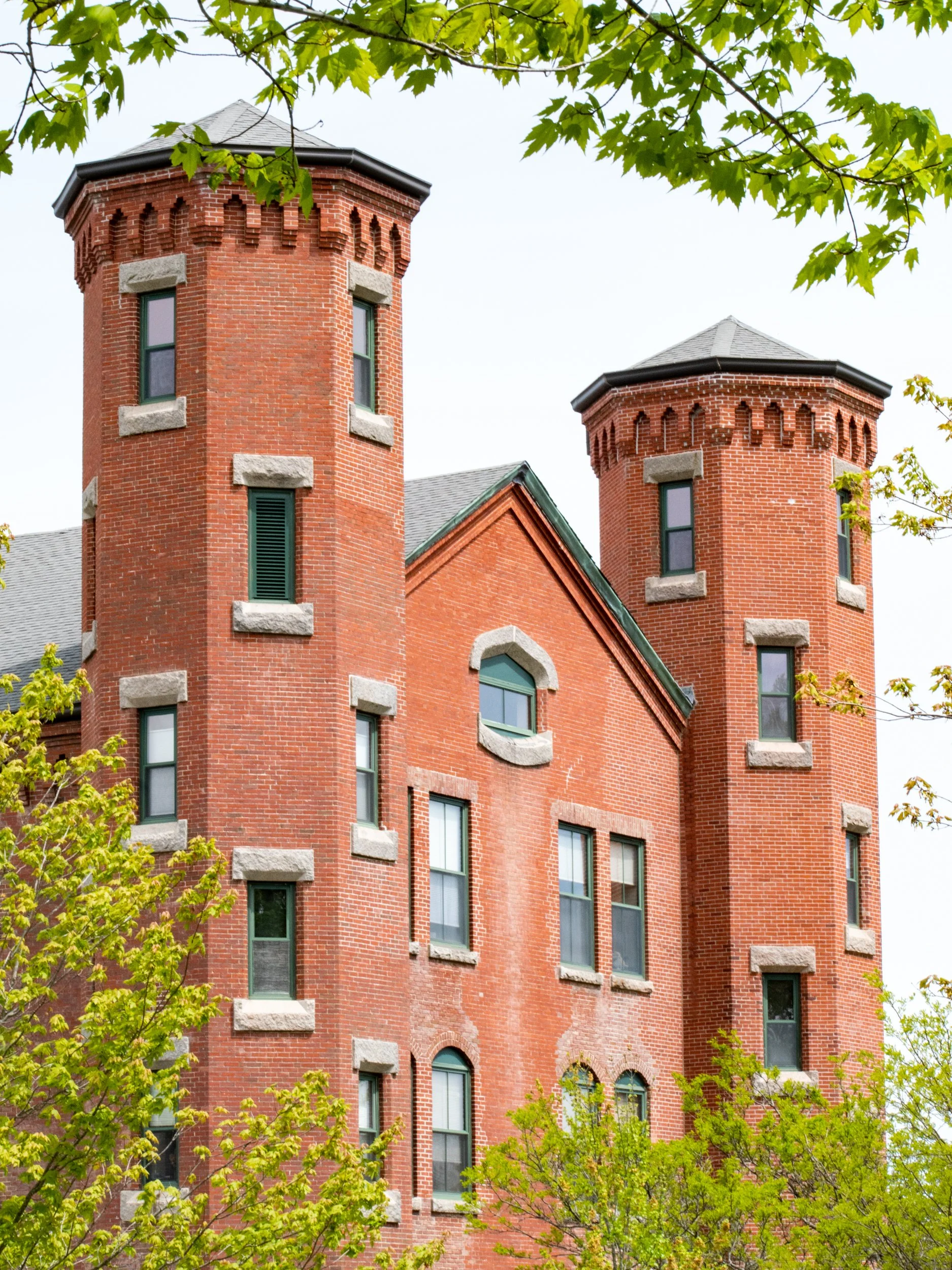
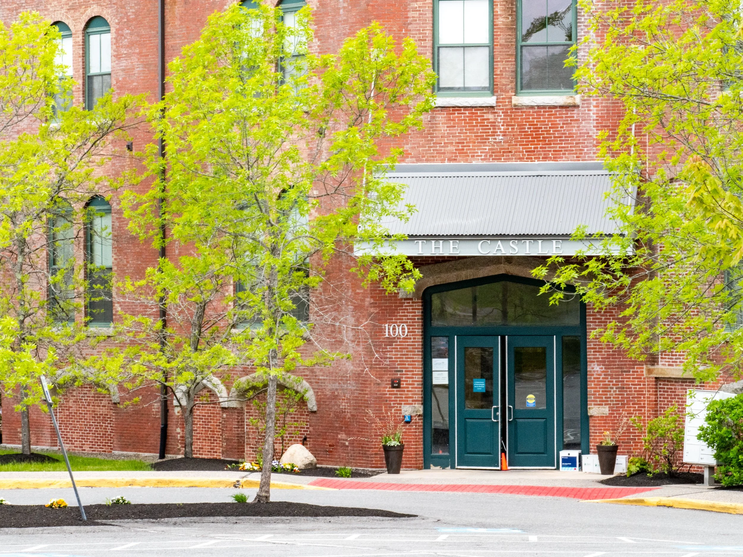
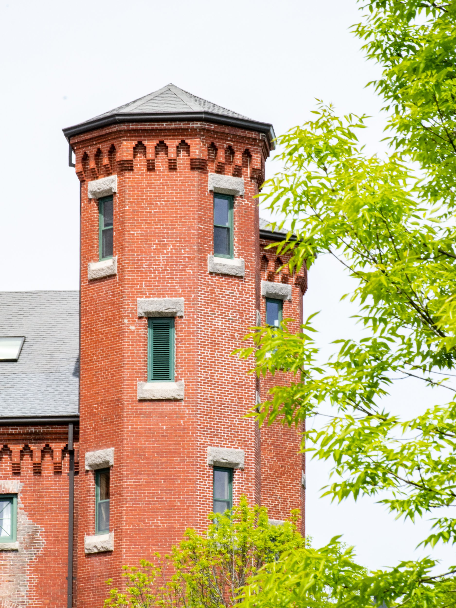
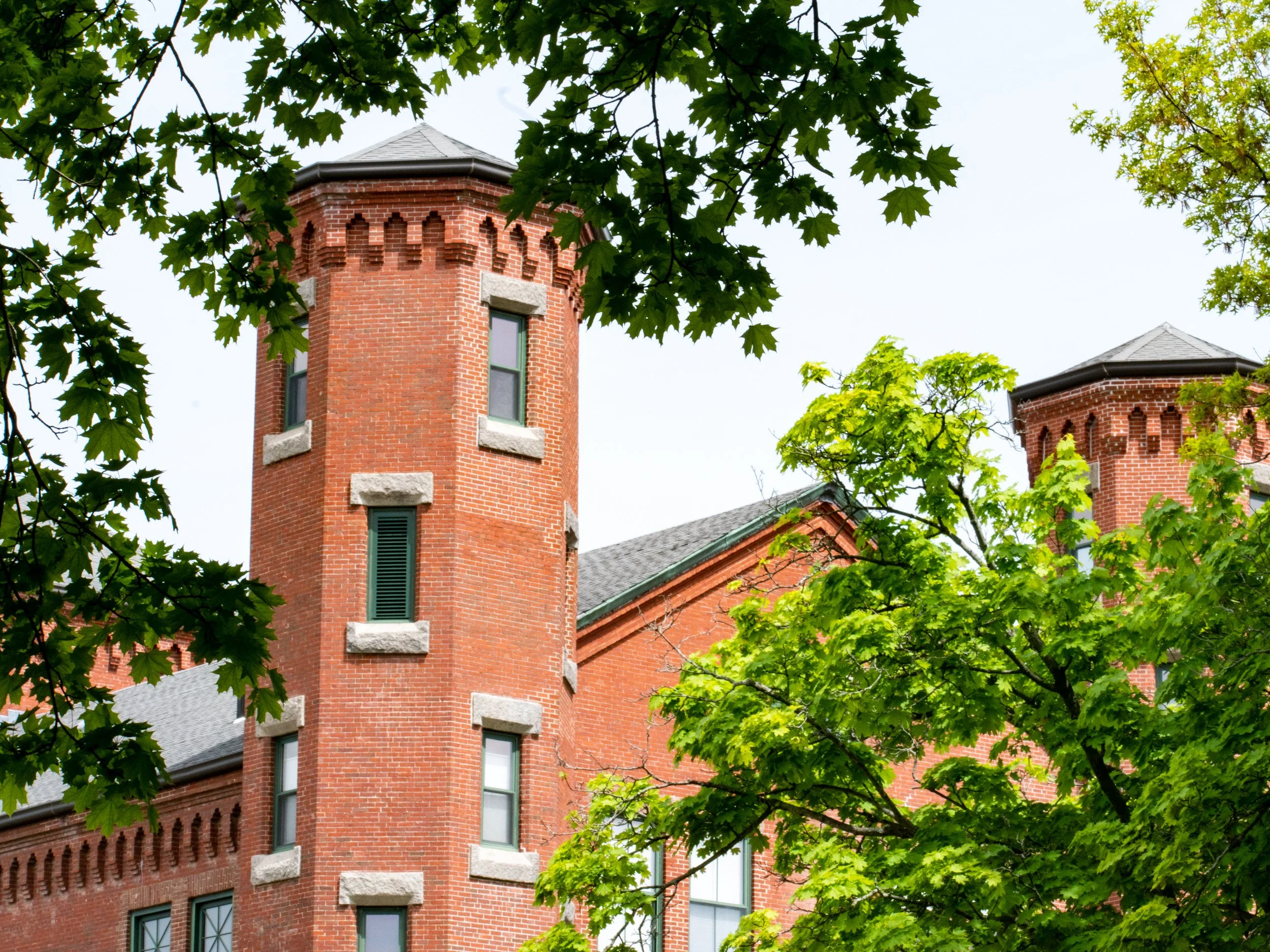
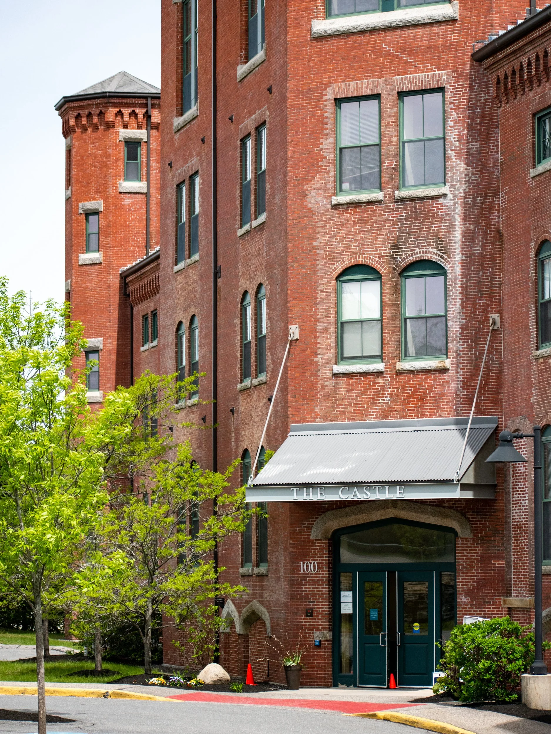
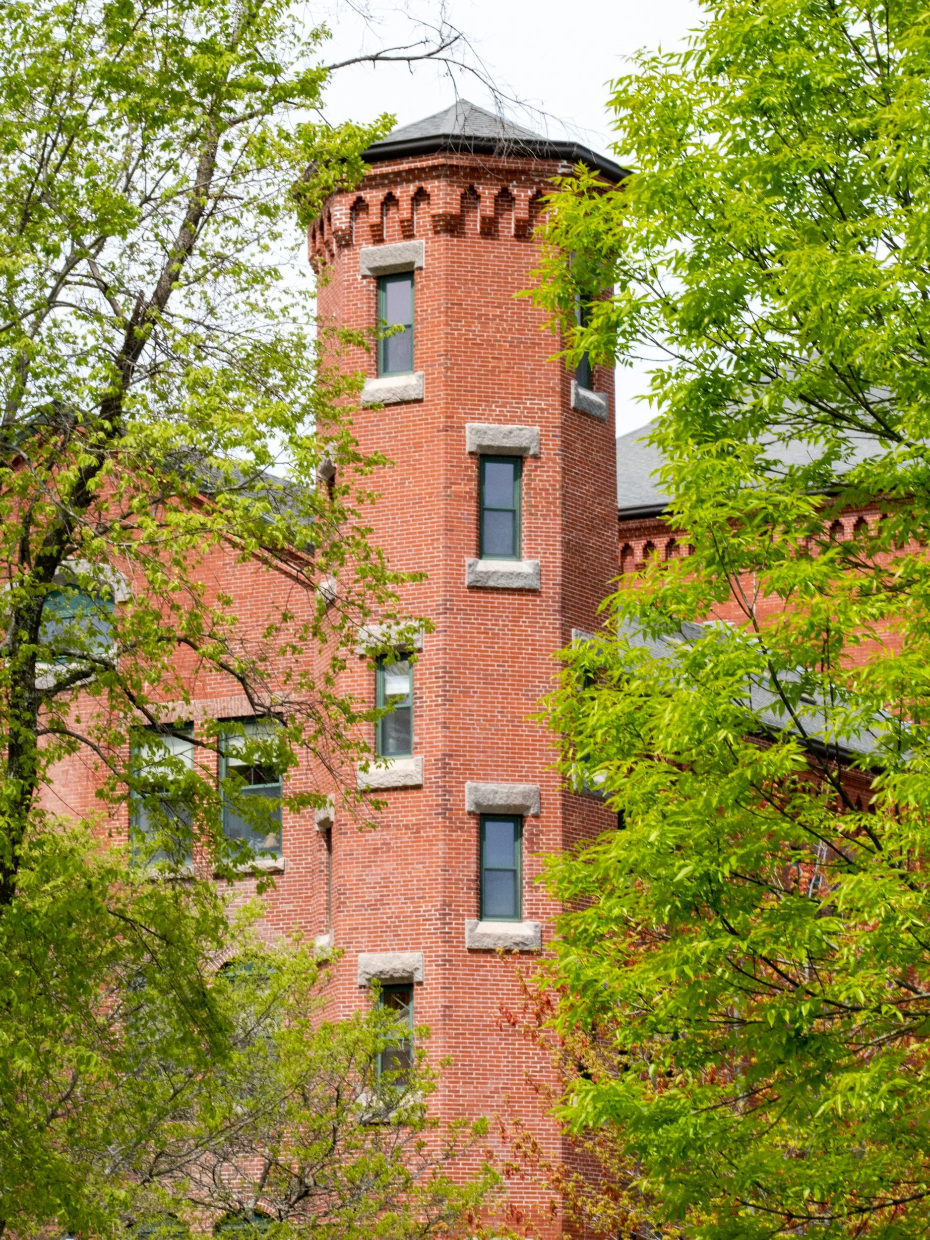
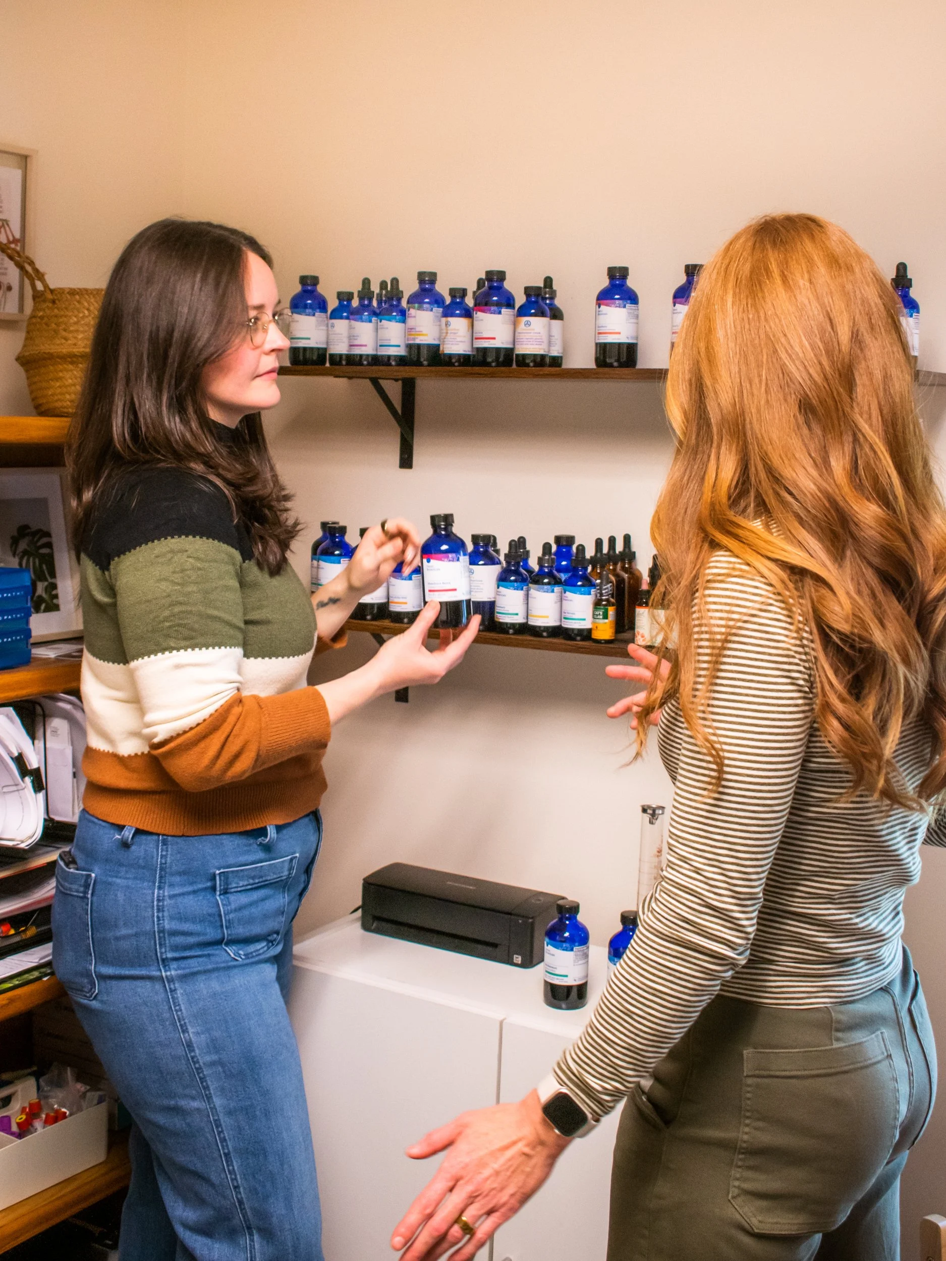
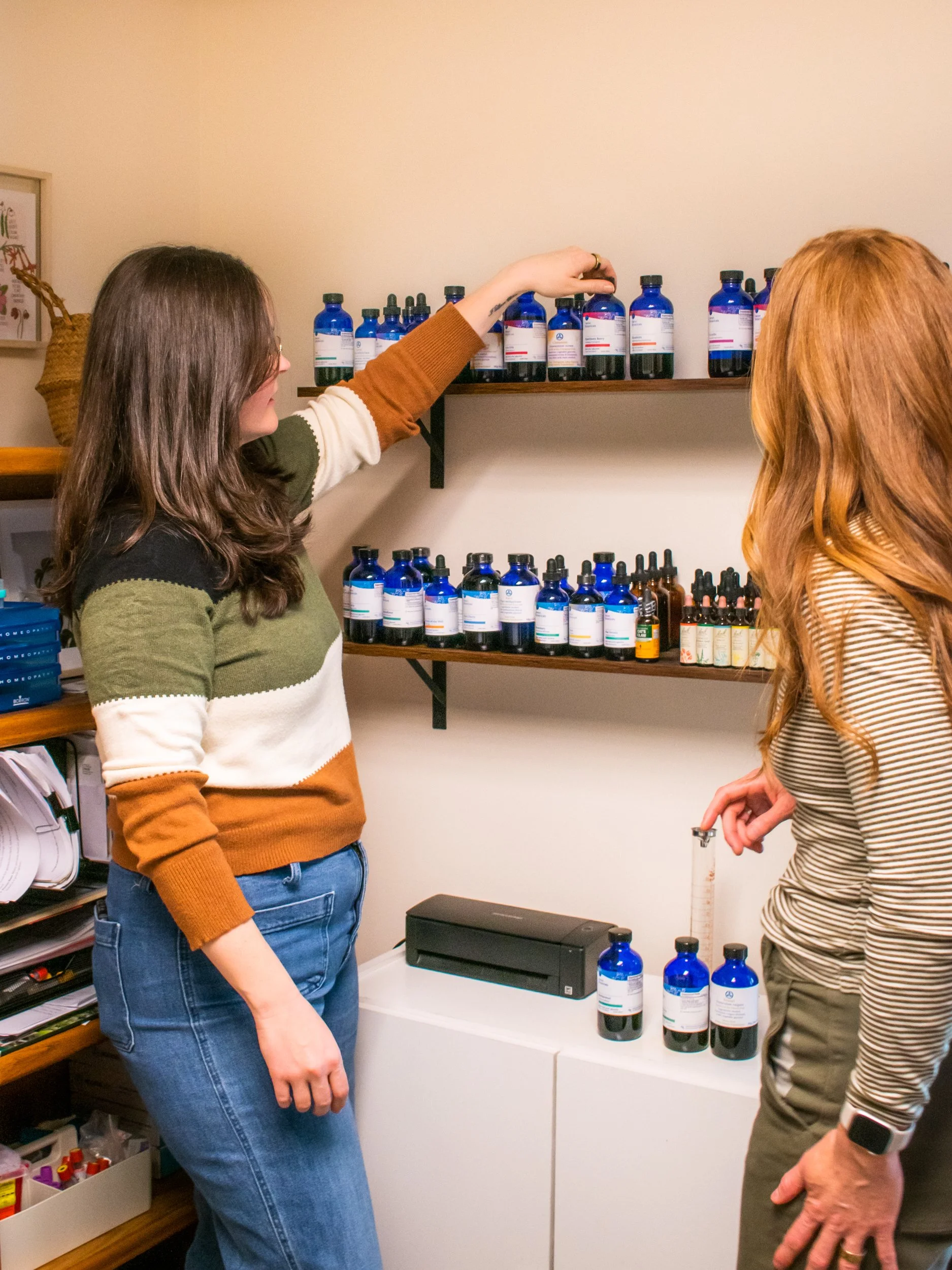
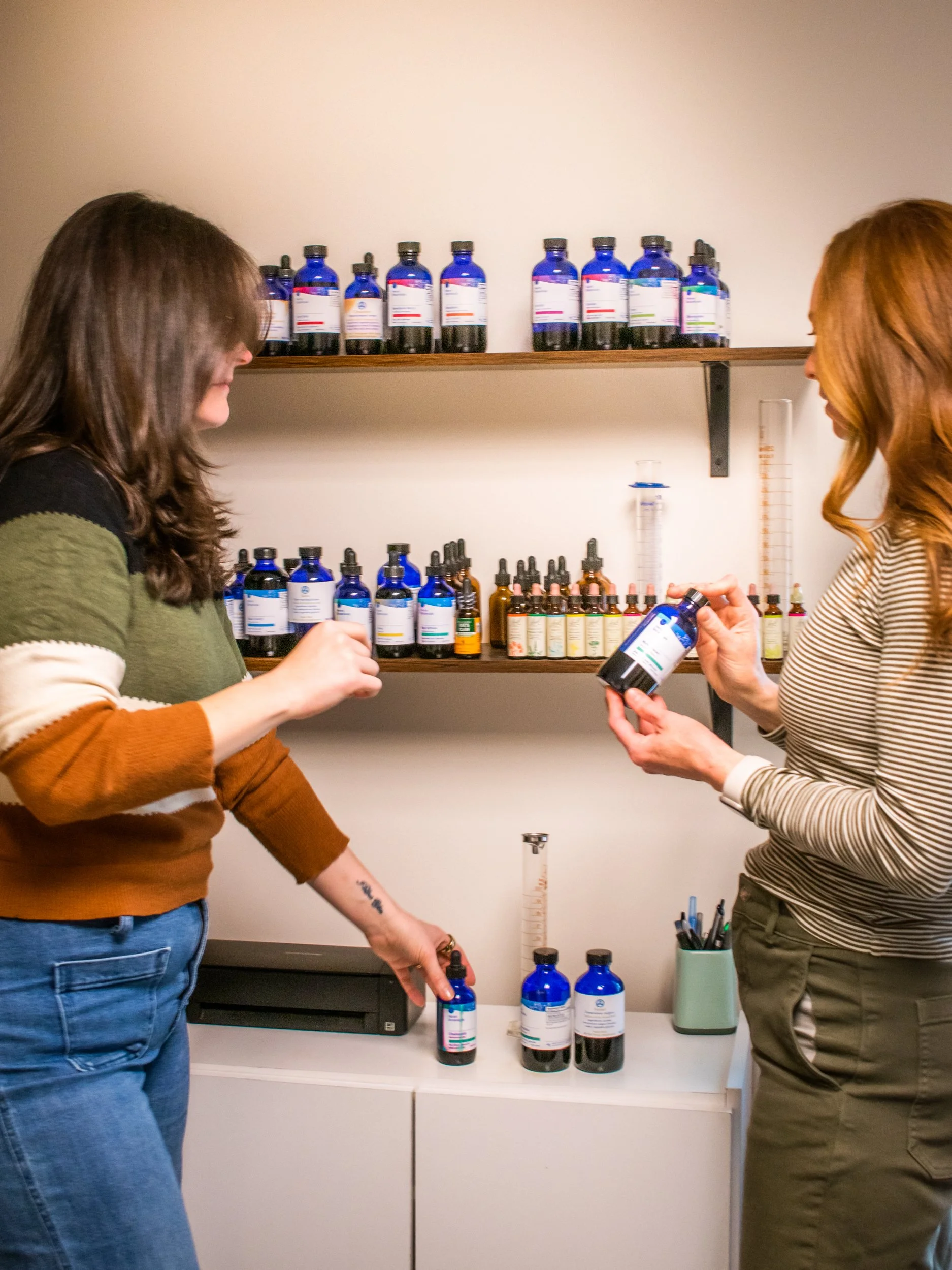
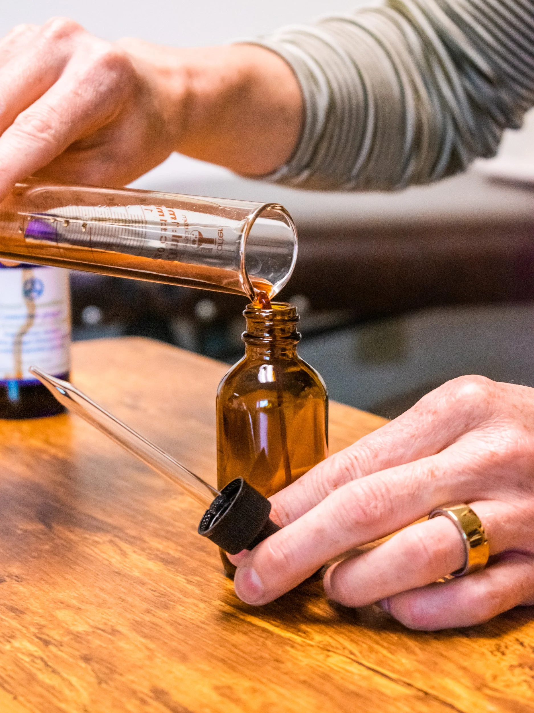
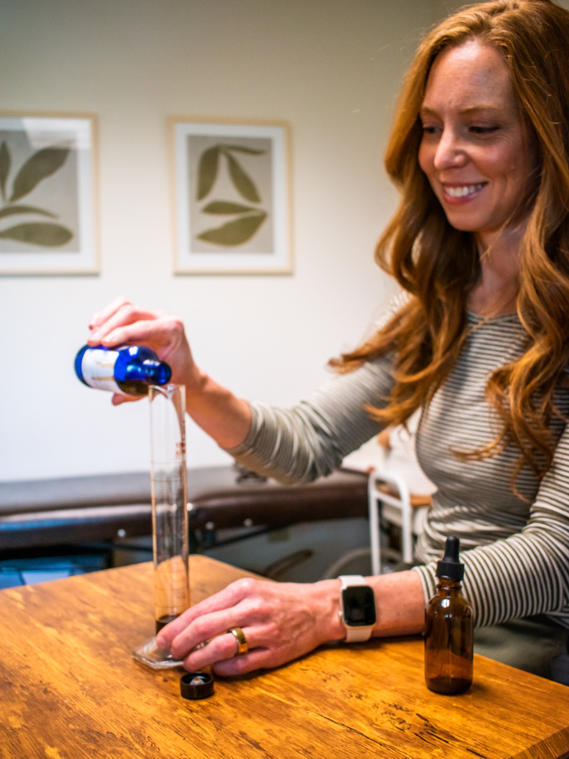
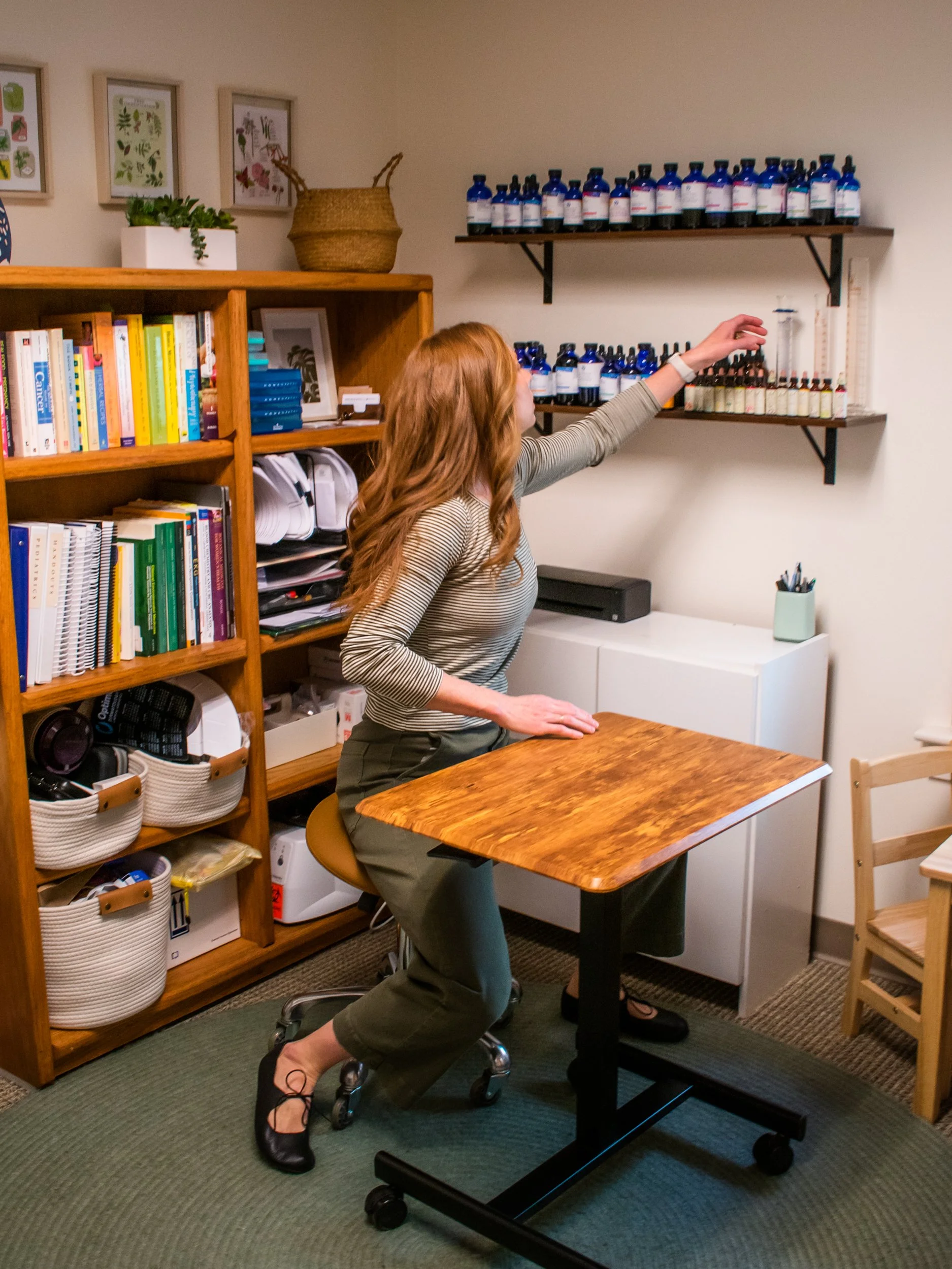
Tara and Sara were also looking for updated portraits, photos of patient care, and images of their office for use on their website, socials and marketing materials. They had a specific shot list of what they wanted to highlight such as vaccine administration, pediatric care, tinctures, waiting rooms, drawing blood, and more.